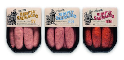
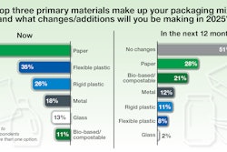
When tasked recently with redesigning the brand identity, tone of voice, and graphic design for four varieties of Simply Sausages gourmet British pork sausages from U.K. food supplier Cranswick plc, design agency Pearlfisher sought to connect consumers’ current desire for authenticity with the brand’s colorful heritage. The 20-year-old Simply Sausages line was created by “sausage guru” and executive chef Martin Heap, known for his open, warm, and eccentric character and his lively, tradition-rich gourmet sausage shop, Heap’s, of Greenwich Village, London.
“Pearlfisher’s Future Insight recognized that consumers are looking deeper into the sources and preparation of their food, returning to recipes that have been handed down over generations, searching for a connection with their food, with the process, the detail, and the ceremony,” says Pearlfisher creative director Natalie Chung. “The opportunity for Simply Sausages was to place this new search for connection at the heart of the brand. The design needed to reflect the expertise of Martin Heap and the vibrant retail theatre of his legendary sausage shop in London.”
New graphics for the packaging—a thermoformed tray with a film lid, decorated with a paperboard sleeve—include a woodcut-style illustration on the sleeve, reflecting the authenticity, craft, and heritage of the brand. For each of the three varieties, a quirky element has been added, depicting an amusing or eccentric character that represents each variant. “For example, Lethal Lucifer no. 666 shows a devil, and The Meaty Italian Job no. 14, an Italian waiter,” says Chung.
Each pack is deliberately copy-heavy, with language created specifically for each variety “to take people to an evocative place,” says Chung. Package colors were chosen to work with each flavor: red for Lethal Lucifer, blue for Smithfield Original No. 1, yellow for The Pork-A-Leekie, and green for the Italian Job.
The package’s black thermoformed tray is embossed with the Simply Sausages logo and is supplied by PFF Thermoformed Packaging. The paperboard sleeve, constructed of Stora Enso’s Tambrite 225-gsm folding boxboard, is litho-printed by Paragon Print & Packaging in six colors plus a special matte UV coating.
Simply Sausages was launched in U.K. retail chain Waitrose in October 2012. Says Chung, “It’s too early for Cranswick to report on the results of the new design, but it has been very well received by consumers, and the grocery and design industries.”