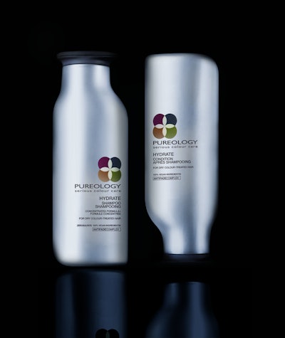
The Pureology redesign, by Robert Bergman, founder of Mpakt and former L'Oreal creative director, takes the form of a sensuously curved, innovative set of high-density polyethylene bottles; one sits on its cap, the other on its base. The bottles are injection-molded of 50% post-consumer recycled material from a single mold and appear to embrace on shelf.
“No matter what a brand’s tone or message, a package must always be stunningly beautiful,” says Bergman. “Image and status are so important in fashion and beauty, so package design is especially crucial to the success of a beauty brand.”
The creative brief for Pureology presented two challenges. First, give the brand, whose original structure was inspired by classic olive oil bottles, and had not been redesigned since its purchase by L’Oreal, a modern, upscale look cool enough to be sold at high-end Paris shops. Second, correct a structural design flaw in which the thin-necked bottle prevented the popular flash-foam effect of the luxuriously viscous liquid.
L’Oreal wanted the new Pureology bottle to appear organic and natural in form, while looking different from all other salon products. Toward that end, Bergman made dozens of exploratory sketches before rendering the finalists in 3D. “If there is a name for that bottle shape, I would call it ‘organically professional,’” says Bergman, whose sinuously curved bottle is innately feminine. “I’m constantly aware of masculine and feminine package design cues; Pureology is definitely feminine, yet highly functional with its wider neck and flip-top cap allowing for easy one-handed use in the shower.”
Finally, the original Pureology logotype was modified and modernized, but moved from its central position to the upper right, and a pearlescent palette applied. “The new, more sophisticated silvery pearlescent colors represent a luxurious evolution of the originals,” says Bergman. “It’s a complete redesign, from shape, to color to graphics, and it has to appeal to current Pureology users while attracting new customers so every nuance must be carefully considered to achieve the brand’s growth goals.”
A 40-mm snap-fit closure tops the container, which holds 250 mL and retails for about $28.00.