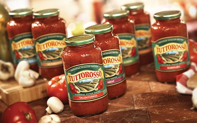
The label can be the most dynamic marketing element on a package, setting just the right tone that can hook a new audience on a longtime brand. Red Gold Inc., a third-generation, family-owned company in Elwood, IN, leveraged the power of the label in extending its Tuttorosso brand of tomato products to appeal to a younger audience.
Tuttorosso is the company’s top-selling brand in the Northeast. Over 20 years, it has built a loyal following among older consumers who prepare pasta sauce from scratch using family recipes that include the Tuttorosso brand of canned tomatoes. In order to continue to grow the brand, Red Gold wanted to appeal to younger women. However, the company’s research determined that while these consumers desire the taste of authentic Italian homemade pasta sauce, they want a ready-made sauce that merely requires heating in order to serve.
Red Gold started by leveraging the equity in the Tuttorosso name and creating a new product, Tuttorosso Original Italian Recipe Pasta Sauce.
“We weren’t trying to convince the first- and second-generation authentic Italian cooks to switch from homemade sauce to jarred. We were targeting their sons and daughters, who are extremely busy and don’t have three or four hours to prepare pasta sauce from scratch,” explains Greg Metzger, Red Gold director of marketing.
Next, Red Gold presented design firm Libby Perszyk Kathman with this challenge: Maximize the package’s visual impact to embrace the Tuttorosso brand’s old-world goodness heritage while appealing to younger target consumers who base their food-purchasing decisions in part on products that save them time.
LPK leveraged the Tuttorosso brand’s core equities on the label. These include a green background that calls attention to a red logo on yellow ribbon, as well as an illustration of ripe tomatoes growing on a vine.
The new label creates a relevant and more contemporary brand expression through richer brand color and enhanced typography, says John Recker, LPK vice president of brand strategy. Emphasizing Italian cues—such as tomato crop pickers—to reflect the brand heritage aids in creating the perception of an authentic Italian sauce, he adds.
Metzger observes that “the new graphics leverage a strong, Italian heritage and reinforce Tuttorosso’s slow-simmered flavor without the wait.”
Relying on Schawk for color separations, Fort Dearborn offset-printed the label. Deeper color saturations enhance the illusion of depth on the label. Recker says this effect makes the typography on the label appear richer and more robust.
A die-cut arch creates a visual entry point at the top of the label and enhances the perception of a premium brand. The side panel on the label contains the “romance” copy. It instills confidence in busy moms that the heat-and-eat product inside, while quick to prepare, contains the old-world goodness that discerning Italian cooks demand.
A glass jar, from Saint-Gobain Containers, also reinforces the premium positioning of the pasta sauce. It subtly displays etched tomatoes and vines on the shoulder of the container. Silgan Closures supplies the metal lid.