As much as packaging professionals hate to admit it, packaging isn’t always as user-friendly as it should be. Child-resistant packaging that gives seniors fits is the obvious example, but it isn’t the only one.
Aware of their shortcomings on the user-friendly front, package designers are beginning to show interest in what’s known as “universal design.” American architect and designer Ron Mace first coined the term in 1985. Mace defined the concept as “the design of all products and environments to be usable by people to the greatest extent possible without the need for adaptation or specialized design.” Products that are designed universally reach the largest possible audience by going beyond the needs and abilities of “average, healthy” adults to include seniors, children, and those with motor and sensory disabilities.
The movement has evolved in the 20 years since Mace coined the phrase and has achieved considerable recognition. The ideas have been widely applied in architecture, product design, and Web design, but they have yet to be applied widely to packaging in the United States.
In Japan, on the other hand, the application of universal design to packaging is more advanced. Toppan Printing Co., Ltd., the world’s number two printer, has been working on applying the concepts of universal design to packaging since 1995. It also developed criteria by which it can measure the universality of a package. The company even goes so far as to advise brand owners to change a pack’s design if it isn’t based on Toppan’s universal design concepts.
“Our advice is wide ranging and is related to the graphics, shape, and structure of the packaging,” says Takayuki Imai, technical manager of packaging at Toppan Printing Co. He sees differences in the American and Japanese approaches to package design. As an example, he observes that Japanese packages are more likely to be designed for ease of opening no matter who’s doing the opening.
Toppan is not the only Japanese company employing the principles of universal design. In a list of trends on its Web site, the Japan Packaging Institute lists the movement toward universal design as an important trend in packaging. This thinking has been standardized in “The Guidelines for Packages in Consideration of the Aged and the Handicapped (JIS00210200).” The standard emphasizes packs that are easy to see, hold, carry, and open.
How about the United States?
In the United States, universal design is just beginning to be integrated into packaging. Within the last 12 months, Procter & Gamble has formed an interdisciplinary team that is applying these principles to laundry products. Paul France, principal engineer at P&G, explains why universal design is a philosophy that his company embraces.
“It goes back to our corporate dream: ‘Touching Lives, Improving Life.’ If we’re trying to realize our corporate dream, then we must strive to design all of our products according to universal design principles and make them inclusive for people of all ages and abilities.”
P&G’s corporate video makes it easy to see why universal design fits with the firm’s strategic vision. Statements in the video include these: “Every one of us,” “Making every day a little better,” “Whose life will you touch today?” and “How will you improve life?” Clearly, the emphasis on inclusiveness that is at the center of universal design fits the P&G philosophy. P&G recognizes the fact that its packaging has the means and the opportunity to positively affect peoples’ lives.
John Bitner, a Certified Packaging Professional and president of an advisory company to the packaging industry, explains why companies like P&G are beginning to think more inclusively. “The life span of the average American has increased by 30 years over the last century,” says Bitner. “We are living longer and healthier. The disabilities and diminished skills of aging cannot be avoided. The market is changing. We’re turning 50 years old at a rate of 10ꯠ per day for the next 20 years. For the first time in history the 55- to 70-year-old segment outnumbers those 18 to 34 years old. The elderly are more demanding. They won’t write. They just don’t buy. In senior friendly testing, the elderly refuse to continue attempts at opening a new package. They simply stop rather than fail. Seniors will protect their right to independence above and beyond all else.”
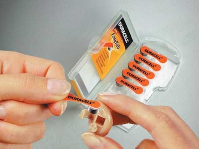
Peter Clarke, president and founder of Product Ventures, knows through research how true this is. Clarke’s firm was hired by Duracell to redesign the packaging for Duracell’s hearing aid batteries. The package in use prior to the redesign was an industry standard. But it was so difficult for some seniors to get the battery out of the package and into the hearing aid that they would save their hearing aids for special occasions, rather than wear them on a daily basis.
“The difficulty in loading of the battery into the device had become such a daunting task that the user had elected to wait for sons, daughters, friends, or their audiologist to change the battery for them,” says Clarke. “Failure to rectify this would have been a great dishonor to the seniors of our society.”
So the Duracell project team and Product Ventures designers set out to solve the problem. First they simulated the difficulties of the user to better understand the target audience. They donned gloves and “coke bottle glasses” to empathize with the needs of those aged 55 and up.
“Our research further cemented our understanding that the current packaging platform—Duracell’s and that of their competitors—failed to meet the needs of end users,” says Clarke. “By gaining a clear understanding of their limitations, we were able to design the right solution.”
The solution came in the form of the Duracell EasyTab. The package actually began to serve as a tool for placing the battery into the hearing aid, eliminating the potential for putting the battery in “upside down” and providing the user with a grippable surface. According to Clarke, the package “empowered the end users, for the first time, to change their hearing batteries, by themselves, without struggling. By enabling the end user, Duracell was able to sell more batteries. More important, the end user could depend on having charged hearing aids all the time.”
This design, while aimed at the elderly, makes the new package suitable for all users, ages, and abilities. One sure indication of how successful it’s been is that Duracell’s competitors have redesigned their packs along similar lines.
Aiming at the youth market
Redesigns aimed at improving utility have also been shown to be an effective business strategy for products that target younger consumers. Bryce Rutter, CEO and founder of Metaphase Design Group, has done user-focused design on numerous packages that are not focused on the 55+ market. He finds that the design industry frequently ignores the ergonomic impact of a package, and he founded his company to integrate scientific research and ergonomics to positively affect design. This integrated approach is the one that was used by Metaphase in 1995 when they worked with Quaker Oats to redesign their 20-oz Gatorade bottle.
The Metaphase team conducted consumption studies at a variety of sporting events with athletes of all shapes and sizes. Metaphase examined the way that athletes stored, carried, consumed and perceived beverages. After analyzing the needs of the users, the result was the Gatorade E.D.G.E. (Ergonomically Designed Gatorade Experience).
The E.D.G.E. was a 24-oz bottle that sported a “grip zone.” The grip zone was designed to work with hand sizes ranging from the 5th percentile to the 95th percentile. The mouth piece, which was designed using anthropomorphic and anthropometric studies, could be opened with the lips. It was found during the study that the 20-oz size did not satiate the athletes, so the size was increased. By targeting a wide range of athletes and truly understanding the needs and desires of these users, Metaphase and Gatorade improved the usability of the design. Consumers responded favorably, as sales have increased by 25%.
More recently, Rutter’s team worked with Kraft Foods to redesign a 1-gal mayonnaise container targeted at the foodservice market. The new design is squarish to optimize the shipping cube, but it has rounded corners and internal surfaces that have been designed to fit industrial spatulas. Additionally, the shoulder of the previous design has been eliminated and the handle closed off from the rest of the container so users can now completely dispense the product. A larger opening allows consumers to scoop the contents of the package without getting their arms covered with mayonnaise. The Metaphase team again explored how consumers used the package, noting that they most often turn it to a horizontal orientation as they scoop the contents. Based on biomechanical studies of the hand, a textured handle has been positioned for comfort when dispensing from the horizontal orientation. In addition, the design of this handle fits hands of all sizes.
Rutter sees this approach to design, which he calls the “Ergonomics of Living Design Process,” as providing a serious competitive advantage. “Factoring the consumer into a package design leads to consistently innovative products, sometimes creating entirely new categories and immediately extracting yourself from the commodity playing field,” says Rutter.
Sherwin Williams’ redesign of their Dutch Boy Paint can is a case in point. Jim MacDonald, packaging engineer at Sherwin Williams, explains why his company thought a redesign of their traditional metal paint can was necessary. “A decade ago, 44% of the paint purchases were made by women, versus 66% today. Women are either the purchaser or heavy influencer in 85% of paint and decorating decisions, so the Twist & Pour can overtly targets women, though men have found the attributes handy.”
The result moved Dutch Boy Paint out of the traditional container into a plastic, blow-molded, square container with a handle, pour-spout, and twist-off lid. Not only did the design appeal to a broader spectrum of users, it eliminated the need for tools to open or reclose the package. MacDonald indicates that the consumer response he most commonly hears with regard to the Twist & Pour is, “What took so long?”
Designing for inclusion = designing for profit
The examples presented here indicate that as companies give more thought to the users of the package as they design that package, they profit. All of the packages presented here have not only reaped financial benefits for their companies, they have received accolades from the industry in the form of awards.
Designs that consider all users, that are universally useful, are likely to continue to see financial gains and awards, given the current trends. In addition to the aging of the market, increasing numbers of people are living with disabling conditions. It has been estimated that 8.6 million people over the age of six have difficulty with one or more of the activities of daily life and 4.1 million people in the United States need some kind of personal assistance. Census 2000 counted 49.7 million people with some type of long-lasting condition or disability in the U.S. They represented 19.3% of the 257.2 million people who were aged 5 and older in the civilian non-institutionalized population, or nearly one person in five.
If today’s packages are not designed with these people in mind, a sales opportunity will probably be missed. Designing for the “widest possible audience” by producing designs that are easy to use is an effective business strategy. Ease of use is something that consumers are willing to pay for, and companies are taking notice.
See sidebar to this article: Upcoming conference
Laura Bix is an assistant professor, Javier de la Fuente is an industrial designer and research assistant, and Hugh Lockhart is a professor at the Michigan State University School of Packaging.