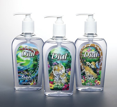
Dial’s 7½-oz bottles of clear liquid hand soap are really ready for action. And not just for cleaning. New three-dimensional, dual-image front labels not only catch the consumer’s eye on the shelf, but they also encourage kids to wash their hands.
That was the goal behind one of the most ambitious label redesigns ever for a consumer product for mass merchandising. All Dial’s partners had experience creating lenticular products—printing behind a light-diffracted plastic “lens”—but few involved packaging. And those that did were generally short-run, promotional packs.
First, Phoenix-based Dial has a partnership with Busch Entertainment to use Busch Gardens and Sea World names in its packaging. “Dial is also the official soap of the Anheuser-Busch theme or adventure parks,” says Heather Schneider, brand manager for liquid Dial. “A year ago, we included some Sea World characters on labels of our liquid hand soap line.” This year’s lenticular label project was far more complex.
Second, Dial’s packaging partners in this project include long-time design consultants, Fisher Design; a specialist firm in lenticular printing, Travel Tags; and CCL Label, whose Memphis, TN, plant has had experience dealing with lenticular labels. CCL Label converts printed lenticular sheets of three designs into rolls of pressure-sensitive labels in a sequence. The roll labels are then applied at Dial’s packaging operations.
Developed plan internally
“We developed the idea internally to try lenticular labels,” says Brian Houck, Dial’s director of creative services. “Through our procurement group, we found the suppliers that could help us learn how to use the technology and flow it into our production. And how it could be an affordable option. We knew the technology was available, and we hoped it was a possibility for labels on this kind of product. We did some quick experimental orders and found out that it was viable.”
At the concept stage, Fisher Design worked closely with Houck at Dial and with people at Busch. “You need to have a good concept. Without it, three-dimensional isn’t going to help,” points out Trey Smith, senior accounts director at Fisher.
Houck says Dial decided to go with a roller coaster because it’s reminiscent of a theme park. Meanwhile, Busch suggested the giraffe image, he says, because it’s one of the primary images it uses in communications. And tigers were exotic and furry, so “we knew we could do something cute with them,” he adds.
Still, all the images were the products of the designers and illustrators at Fisher. For each label, two separate images were needed because that provided the animation or motion feature as the label is viewed from different perspectives.
Learning about lenticulars
Before the images were finalized, all of the partners participated in a telephonic seminar on lenticular images. “We had a conference call to outline the guidelines we offer about the images that work best, the colors, and contrast,” says Ryan Kjolhede, sales associate at lenticular printer Travel Tags. “Fisher then produced hand-drawn images and then converted them to high-resolution computer images they sent to us.”
Travel Tags took those images and performed an operation they call “interlacing.” Because each label has two separate images, interlacing is the process of putting the two images together with an overlap. What’s critical at this step, says Kjolhede, is keeping in mind the radius curve of the bottle surface. The goal, he says, is that “first your eye focuses on image A. As you move, the focus becomes image B. That’s what we call a simple ‘flip.’”
Once interlacing was done, Travel Tags produced proofs in about 48 hours. “We had several rounds of different ideas between Fisher, Dial, and us,” Kjolhede recalls. Travel Tags’ proofs were critical in critiquing and improving the images, says Fisher’s Smith. “They manipulated the artwork to fit the radius of the bottle. So if you actually look at this label flat, it’s nowhere near as dimensional as it is once it’s applied to the curve of the bottle.”
In this process, Smith says, the partners all discussed which elements needed to come forward in the image and which ones should be pushed into the background. “Once we had the images nailed down, two for each label, it took our designers about a week for each label to be fully illustrated and to be ready for production.”
During this time, CCL Label became involved not only for its expertise with lenticular labels, but also for its guidelines for converting sheet-printed labels into p-s labels on rolls.
Producing the lenses
Once the artwork was finalized, Travel Tags went to work to suggest the best lens through which to view the art. The company has worked with a number of extruders who produce the sheet that becomes the lens.
“Our first trials with CCL were with a 10-mil amorphous PET sheet that is ‘engraved’ with lenticules [grooves] of 180 lines per inch,” recalls Bob Hanson, sales manager at Travel Tags. “However, we found the 130-line lens is far superior in the animation you’re able to achieve in printing on the back of the lens.”
The lenticules are achieved in-line with extruding of the sheet; the sheet is passed over a cylinder that creates the lenticules. In fact, Travel Tags owns some of the cylinders used for creating the lenticules. The company declined to name the companies that produce the lenticular sheet. At Travel Tags, the custom lens sheets are then reverse-printed offset in four-color process.
But it’s not quite so simple, says Kjolhede. Producing a three-dimensional image is “essentially layering the images to give it the depth of a 3D image. It’s the most complicated of all lenticular printing because we have to create the three-dimensional depth, along with creating the two-phase image flip.”
Even Gary Dillhoff of CCL Label agrees that sheet-fed offset is the best quality printing for lenticular labels. “We knew that the highest quality printing of lenticular is done sheet-to-sheet offset,” he says. “We decided long ago that our expertise would be in converting those lenticular sheets into rolls of pressure-sensitive labels. So we go from printed sheet to rollstock with our patented process.”
Similar to multipart labels
CCL Label’s Memphis plant has a lot of experience with converting specialty labels, whether lenticular or multipanel labels.
First in CCL’s process is to guillotine-cut the sheets into smaller sheets, individual squares that can be single-stacked two-up in miniature magazines. These labels are then automatically transferred directly onto a roll of pressure-sensitive adhesive on a carrier web. Each lenticular label is then die-cut like traditional p-s labels, and the waste area of the label and adhesive is stripped away in a matrix scrap web leaving the labels in place on the roll, ready for application.
That means that Travel Tags needs to provide sufficient bleed area around each image so that it can be easily die-cut. Plus CCL only uses adhesives that meet Dial’s requirements.
“We also do some special things for these labels,” Dillhoff says. “Since this is a thicker label than normal, we use special cores and do some things to help prevent curling.” In addition, CCL mounts the labels sequentially on the roll: one roller coaster followed by one giraffe and one tiger.
“We produce the containers for mixed cases, four of each design in each case of 12,” says Dial’s Houck. “By having CCL produce the labels sequentially, we end up with very efficient flow-through production so we achieve a mixed case without going to a secondary operation.” By selling a mixed case, retailers achieve multiple designs on the shelf in a minimum of space without having to buy three cases, he adds.
Also key was that the package’s front label was the only change. The custom bottle is about five years old, Houck says, and the pump has been in use even longer. Because the label is reverse-printed, Dial didn’t have to protect the label from abrasion. “We do extensive package testing, and these were ship-tested to ensure conventional shipping didn’t cause any problems to the labels.”
When Dial was asked about label economics, Schneider said it was important, but it wasn’t a major issue. “We wanted to do something extra special, so it gave us an opportunity to look at new, innovative packaging. In liquid hand soap, packaging is one of the keys. So the appearance of this label really serves two purposes: one, it attracts attention in the store, and second, it looks special in the home.”
The bottles with the new label will be available from spring to fall 2003. “So we’re also likely to be doing a winter redesign for October,” Schneider says.
CCL’s Dillhoff is also excited about this program. “I commend Dial for trying this,” he says. “And using it for a standard product is unusual. You don’t typically see lenticular labels in your mass merchandisers.” Although several companies have approached CCL about doing this, he says: “Dial is the first one to really pull the trigger in a major, commercial way.”