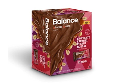
The Balance Bar Company has repositioned its nutrition bars with packaging that emphasizes their decadent side first followed by their nutritional advantages. The new graphics were designed, says Balance, to appeal to consumers’ emotional connection to the brand, with images of rich chocolate, caramel, and peanut butter poured across the packaging, and nuts and other ingredients peeking out from underneath.
The change came with the introduction to the line of four new flavors and new bar sizes, including a mini-bar. “We changed the packaging for our original flavors and our great new flavors to ensure our entire line is now wrapped in deliciously decadent packaging that truly showcases what the brand is all about: providing consumers with undeniably delicious yet smart snacking options, or, as we like to call it, ‘craveable nutrition,’” explains Monique Acevedo, VP of Marketing for Balance.
The last design update for Balance Bar flow wraps and cartons came in 2014. While Acevedo says the graphics were “nice,” they did not communicate the bars’ balance of smart nutrition and indulgent taste. Mindful of the category’s tendency to take a scientific and serious approach to packaging graphics, Balance sought to bring fun, eye-catching colors and delicious images to the store shelf.
“Our goal in developing the new packaging was to create a modern, colorful, and deliciously decadent-looking design, one that is easily identifiable in-store, speaks to our craveable nutrition brand positioning, and highlights the flavors and main ingredients of our bars, for example chocolate, cookie dough, caramel, peanuts, mint, etc.,” says Acevedo.
The new Balance Bar packaging is more individualized for each flavor variety and brings an array of colors—green, orange, red, and teal among them—to a brand formerly known for its use of blue.
Balance worked with brand strategist and designer Hatch to restage the packaging, which was launched in summer 2016 in retailers nationwide as well as online. Balance even offers an Amazon dash button, “for when hunger hits.” Four new flavors include Chocolate Peppermint Patty, Dark Chocolate Pecan Turtle, Chocolate Caramel Peanut Nougat, and Dulce de Leche & Caramel.