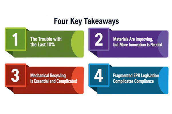
Tapping into the nutrient-rich superfoods of the ancient world, Richmond, VA-based Health Warrior launched its business in 2012 with the introduction of a 100-calorie snack-size bar made with chia seed—a favorite of the Tarahumara Indians and Aztec and Inca warriors. The success that followed prompted the company to complement the line with a full-size chia protein bar.
To design packaging graphics for the new bar, Health Warrior worked with advertising/design agency LRXD. The goal was to differentiate the graphics for the protein bar enough so it was clear it was a new and distinct offering, yet retain sufficient visual cues from the original chia bar so it would still fall under the Health Warrior umbrella.
Explains Kelly Reedy, CEO of LRXD, “The creative needed to reflect Health Warrior’s spirited, authentic, aspirational, motivational, passionate, gritty, and humble core values and appeal to its sweet spot of female buyers.”
To accomplish these goals, as well as showcase the brand’s unique proposition—the use of real-food ingredients—LRXD honed in on a design directive that would bridge the aesthetics of the ancient and modern worlds by using packaging that would reflect the wisdom of Aztec and Inca warriors and the latest nutritional findings. “Ultimately we designed a visual language that conveys a Modern Primitive aesthetic,” says Reedy.
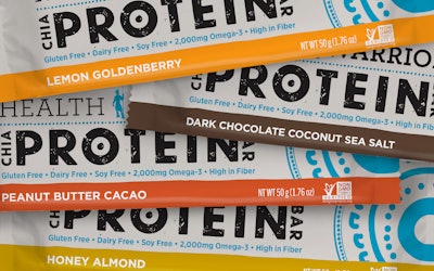
The 1.76-oz protein bars are packaged in wrappers that evoke natural fibers and are decorated with pre-Guttenberg-style printing. The typeface, modified from an existing font, is presented in all caps, reminiscent of ancient Greek lettering. In addition, the type is slightly distressed to give the impression it was inked using a hand-carved wooden stamp.
Elements retained from the original bar packaging include a warrior icon, the brand logo, and a shield graphic. Secondary elements include an ecru-colored canvas decorated with minimal bursts of colored text and a line of vibrant color—gold, turquoise, yellow, or terra cotta—at the bottom of the wrap to distinguish each of the line’s four flavor varieties.
In contrast to the Chia Bar graphics, the Chia Protein Bar displays the Health Warrior logo above the product name in type of roughly the same size. On the original bar, the logo is significantly smaller, leading some consumers to believe that “Chia Bar” is the brand name. To further tie the products to the true brand name, LRXD rotated the words “Chia” and “Bar” 90 degrees, which gave “Health Warrior” and “Protein” a subtle, yet direct, visual connection.
Health Warrior Chia Protein Bars are now available through the company’s website as well as at national retailers that include Target, Mariano’s Fresh Market, Whole Foods Market, and other specialty health food and grocery stores.