The newest addition to the snack-food aisle started as a simple family recipe for popcorn. Its flavor was a mixture of sweet and salty, with a subtle, spicy kick at the end. For decades, this recipe remained a secret; the delicacy was reserved for friends and family only. However, its growing popularity encouraged one family member, Demar Mills, to consider taking the popcorn to the public. In 2011, Demar and his wife, Whitney, launched Miami-based DemWhit’s Culinary Creations and its cornerstone treat was dubbed Manna.
When it came to packaging Manna and putting it on the shelf, DemWhit’s faced several challenges. On the one hand, the company wanted the product to stand out in the competitive organic snack-food landscape. This would be accomplished by reinforcing that the product is an all-natural option, yet still maintaining the look and feel of a premium product through high-quality graphics. At the same time, Manna required packaging that would preserve the popcorn’s unique flavor and freshness—Manna is the first ready-to-eat popcorn using pure grapeseed oil; it uses all non-GMO ingredients; and it is sweetened with organic evaporated cane juice.
The process was further complicated by a strict time constraint—DemWhit’s goal was to have Manna on store shelves within a month’s time to capitalize on the “high consumer demand for popcorn products and the need for innovation in the space,” says Demar.
DemWhit’s COO Peter Rood hailed from a printing and packaging background and initially doubted that the deadline could be met. “I was skeptical that we would find a partner capable of addressing our quality demands within the time constraint,” he says. Recognizing this challenge, Rood conducted a wide search through his industry connections to find a solution. Fortunately, his concerns were alleviated after finding a packaging supplier known for its ability to get projects completed quickly without sacrificing quality.
Flexible packaging provider Star Packaging Corp. was able to make a compelling case to meet DemWhit’s needs. Rood desired hermetic seals, product freshness, eye-catching graphics, and superior stiffness compared to many bags found on store shelves. Star’s packaging development team designed a film structure that met all of these requirements.
Collaboration ensures specs met
Star worked in conjunction with DemWhit’s to identify specific characteristics and challenges to meet all the brand owner’s package requirements. To ensure the popcorn stays fresh and the flavor is preserved, Star developed a hermetic, high moisture and oxygen-barrier lamination of 60-ga oriented polypropylene/48-ga metallized PET/125-ga linear low-density polyethylene that locks in freshness and maximizes shelf life for up to six months, accommodating overseas exporting requirements.
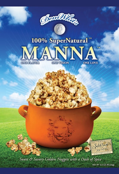
Package graphics were conceptualized by Demar and Whitney Mills, with Studio C Collective creating the digital graphics for the package. “The DemWhit’s logo and typeface were designed with a very simple, timeless, and classic appeal,” explains Demar. “The coin [pictured under the logo] represents my grandmother, Mama Lillie. She was the inspiration behind the artisan recipe.
“We researched the color blue in our logo design process. It is the overall favorite of consumers and tends to elicit very positive subconscious reactions in people. The bright-blue sky and green grass represent nature at its best. This design supports our 100% SuperNatural product, utilizing not just natural ingredients, but ingredients that offer the extra benefits of nature. Our brand proposition is to offer high-quality, flavorful ingredients at affordable prices.”
Adds Rood, “Food packaging puts a heavy emphasis on visuals and how closely the image of the product resembles the actual product inside,” he says. “In order to communicate visually that the popcorn is organic, we chose imagery that features a vivid green meadow under a clear blue sky.”
To achieve superior image quality on the package, the print job required precise graphics and tight registration. This led to a close collaboration between Star’s graphic team and DemWhit’s designer, ensuring that the image could be printed as designed on a flexo press. Star then printed the bag film on its 10-color Windmoeller & Hoelscher Miraflex CM flexo press, equipped with an automatic impression setting, to create a high-definition, crisp image. With a service-oriented mindset, Star was able to get the job done and stay on schedule.
Product pops on vibrant packaging
Manna now includes a variety of features to distinguish it on the competitive retail shelf. The final 4.5-oz package feels sturdy and resilient to consumers and communicates a tactile sense of product quality. On the front of the package, an accurate image of the popcorn is displayed among the vibrant blues and greens, naturally enhancing the golden color of the popcorn and making the product stand out on the package.
A mere four weeks after beginning the project, Star completed the package and shipped it to DemWhit’s co-packer in California to prepare for the test launch of Manna. The speed to market was invaluable to DemWhit’s. “Star Packaging became more than just a purchasing agent,” says Rood. “I was highly impressed with Star’s work. The consistency of the image on every bag, combined with the pronounced use of color, helped us build strong brand recognition while creating a unique package that makes sure Manna stands out on store shelves.”