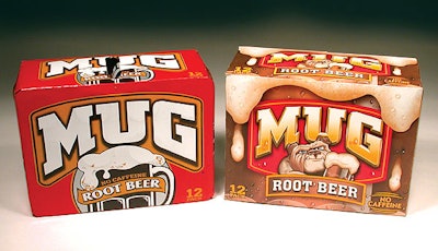
After a long design incubation, Pepsi-Cola relaunched its Mug-brand root beer with a new label last spring designed to appeal to both teen boys and to their mothers who buy soft drinks for them.
“The brand people came to me for a redesign for Mug root beer because they felt the existing design had no personality,” says Ron Udiskey, senior director of design for the Purchase, NY-based soft drink company. “We took the concept in several directions and worked with a number of design firms along the way. Eventually, one design came right to the top because it included a bulldog on the label. It was like, ‘whoa, the brand finally has a personality.’”
The redesign
Previously, the brand design was an illustration of a drink mug with foam running over the top. However, Pepsi’s marketing people identified a mid-teenaged boy as the target for Mug root beer, even though it also had to appeal to their mothers who actually buy the product.
“If we targeted directly to kids, then we’d alienate the older kids,” points out Rita Stockett, Mug marketing manager. “So we wanted to have an appeal to older kids, without turning off the younger ones. After all, the younger teens aspire to be older.”
Along the way, Culver Design developed the face of the dog that Pepsi preferred, and the company then worked with Character LLC to test the image and to develop a story behind the dog that appears on the Mug root beer Web site. However, as Stockett points out, the label’s bulldog brings an attitude to the brand that’s designed to be bold.
“Root beer has a more rugged flavor than most soft drinks, so we didn’t want a lovable bulldog like a house pet,” Stockett says. “We wanted one that looked more earthy and bold.” At the same time, Pepsi had to be careful to separate the dog image from the creamy foam. Any hint of a dog foaming at the mouth would simply not do.
Meanwhile, Udiskey was working with Deutsch Design Works, which had created the foamy look that Pepsi really liked. “So we gave them the dog image we liked to merge with the foamy appearance, and we went through several iterations until we settled on this design,” Udiskey says.
“The object was to make the brand look more exciting and to create a character that would relate to teens,” says Barry Deutsch, creative director and president. “We don’t claim any credit for the image of the dog; that was brought to us. But they liked our treatment of the foam, so we put the two elements together.”
Adjusting for print
Although there was little difficulty transferring the design to label or multipack printing, gaining good can graphics were more difficult, Udiskey adds. When he first took the new graphics to Pepsi’s procurement department, he says he was told, “‘This will be a challenge!’”
“Originally, our people were able to use four colors in a process way, along with some spot colors for the red we use for the brand. When we were showed the first runs by the can decorator, they were acceptable. However, when they started printing at production speeds, they were unable to hold the tolerances,” Udiskey recalls. “So we went back to the drawing board and took out some screens that were filling in with ink.”
By the next runs, the color issues were solved and the new Mug root beer was on its way. Or as Deutsch says, “the pup learned its first new trick: leaping off grocery shelves and landing in shopping carts.”
That’s verified by Stockett. “Obviously, the new design is more powerful, and the velocity of the product has increased,” she reports. “By the end of last year, we saw about a 3% sales increase for Mug. What makes that even more impressive is that there was relatively little marketing support behind the redesign.”
In fact, the new look for Mug has performed so well for Pepsi’s bottlers and canners that Stockett says they’re clamoring for new designs for others of Pepsi’s brands. Or as she puts it, “everyone wants to be top dog.”
