Some designs elevate glass containers to an art form, while others do it with labeling and decorating. Still, all the Clear Choice winners for 2000 display the packaging creativity that’s likely to make them winners in the marketplace. The Clear Choice competition is sponsored by the Glass Packaging Institute (Washington, DC). Eight winners were selected from more than 100 entries.
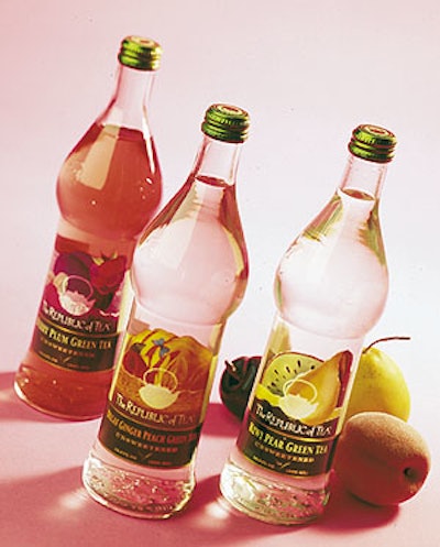
The winner for package design was a line of bottled green teas (1) from The Republic of Tea, Novato, CA. “We wanted to be the first to come out with a line of five unsweetened teas for the retail market,” says Ron Rubin, company president. “I don’t know of anyone that has a decaffeinated, flavored green tea that is all-natural.” The line was first marketed to restaurants.
Vitro Packaging (Dallas, TX) manufactures the distinctively shaped 0.5-L bottle in Mexico where it also applies the heat-transfer labels, one for each of five fruit flavors. Labels are Clear ADvantage from Avery Dennison’s Decorating Technologies Div. (Framingham, MA). In this case, says Avery’s Carol Fandino, the converter prints the labels in wide-web gravure format using a total of nine colors, including a premium gold metallic color that borders the box that displays the flavor.
The gravure ink is printed directly onto a carrier web. At Vitro’s plant, a Model TD1000 applicator applies heat to separate the inks from the carrier and applies them to the bottle. The custom bottle has embossed into it a teapot logo and, on the bottom, the brand’s slogan, “sip by sip, instead of gulp by gulp.”
“This is a very high-end type of decorating,” says Lee Farlander of Vitro, “but this is a premium product that carries a high retail [$2.99].” And, says Fandino, once the application equipment is in place, heat-transfer decorating can be less expensive than pressure-sensitive labels.
Organic bottle, organic vodka
Rain vodka’s graceful new bottle (2) and decorating was a winner in the spirits category for New Orleans-based Sazerac’s super-premium brand of vodka made exclusively from certified organic grain. “Essentially, we needed to update her wardrobe before taking her out,” is how Rain’s brand manager Rebecca Green explains it. Previously, Rain was packaged to show off its natural, organic “green” heritage.
The bottle and its graphics were designed by Spar (New Orleans, LA), a package design firm that formerly was a department at Sazerac. “The redesign of the package and decorating actually took about two years,” says Lane Kasteix, general manager at Spar. “We had to design the bottle from scratch, and the bottle decorating was a real challenge, too.” The container was designed by Spar’s Catherine Corley-McAcy.
“We wanted to create a strong shelf presence while allowing the customer to see the clarity of the product, unlike other completely frosted bottles,” says Angela Nicole Wise, a spokesperson. “The solution was to fully frost the bottle at the top, which has a greater shelf presence than a completely clear bottle. Then the frost fades to clear at the bottom of the bottle to allow the clarity and purity of the vodka to come through.”
This Rain bottle was made in Mexico City at Vitro’s Bemex plant that normally produces premium-quality bottles for cosmetics, explains Farlander of Vitro. “This is an exceptionally clear flint bottle,” he says, “made from high-purity silicone sand.” Kasteix says the “sparkle and snap” of the cosmetics-grade glass was very appealing to Spar.
Keeping the registration of the logo and frost areas consistent was a real challenge. The decorating was done by Quest (Hillside, NJ). The frost effect is achieved by a spray that is baked on. Then each of the three colors and a flux is screen-printed and also baked on, one color at a time, to achieve the ceramic labeling, Wise says. The flux provides a smooth base for the silver color, Kasteix says, and the blue is applied last because the organic pigment is applied at lower temperatures than the other colors. The filled bottle is sealed with a cork topped by a cobalt-blue ball and a shrink band, all from Saxco (Horsham, PA).
Rain sells for about $20 per 750-mL bottle. “Our distributors are extremely excited about the new package, and we expect to double our sales with the new look,” says Green.
Nostalgic bottle
Recalling its heritage was the concept behind the Coors Classic Bar Bottle (3) that won an award for beer. Owens-Brockway (Toledo, OH) makes the bottle.
“Original Coors was the brand, and Coors marketing people extensively researched our archive of old packaging,” says Ray Toms, who is R&D packaging innovation manager for the Golden, CO-based brewery. “Our design advisors participated in some brainstorming sessions, and they came back with some design ideas for the bottle and for the graphics.” Landor Associates (San Francisco, CA) is Coors’ design consultant.
The bottle has two neck rings. One neck ring was common on early bottles to aid in transferring the bottle in the filling line. The second one, Toms says, was added as an easy-to-grip feature. The bottle was marketed last spring for about a month to all of Coors’ on-premise outlets. “It really got good reviews,” Toms says, “but of course the glass costs are a lot higher than our current longnecks. So, for an everyday bottle, it would be tough for the brand to accept the costs.”
The front of the deep amber bottle is decorated with a clear p-s label from Spear (Mason, OH) that resembles ACL decoration. The back of the bottle has a mountain waterfall embossed into the glass.
Calling it an “in-and-out bottle,” Toms was saying little about this bottle’s future.
Square deal on wine
A square-based resusable wine decanter for several varietals made by Corbett Canyon (4), Arroyo Grande, CA, was a winner for Anchor Glass (Tampa, FL). The hourglass-shaped decanter is closed by a 72-mm, tinplate DSR cap from White Cap (Downers Grove, IL). The decanter was first introduced in November ’98 and is used for five wines. The Wine Group (San Francisco, CA), a consultancy that says it’s responsible for Corbett’s packaging, designed the square decanter. Labels are converted by Spear (Mason, OH). No further details were available.
Frutta keeps it simple
When Bellevue, WA-based Frutta Inc. moved its line of Frezza Italian Sodas (5) from a cylindrical polyethylene terephthalate bottle into a custom-made glass bottle, graphic design was revisited. Manufactured by Columbia Packaging (Vancouver, British Columbia, Canada), the shift to a glass bottle revitalized the brand, opening up the doors for expanded distribution, says Frutta’s Christopher Antony.
The winner for carbonated beverages is a subtly inverted cone shape designed to fit comfortably in the hand. However, according to Antony, sleeve labels wouldn’t fit snuggly. So applied ceramic labeling was one of the few options available. Universal Specialty (Vernon, British Columbia, Canada) decorates the 16- and 10-oz bottles in three colors.
Another factor, says Antony, is that ACL is “ice-proof.” Since Frezza is distributed mainly to convenience and grocery stores, Frutta needed decorating that could withstand extreme cold and wet conditions from the bins of ice where the product is often stored.
Frutta was searching for graphic differentiation from other beverages, a proprietary image that would be easily recognized. The proprietary Frezza sun graphic is surrounded by symbols that resemble the olive branch. This strong Italian-inspired design is placed in the center of the clear bottle, set against the bright colors of one of the four flavors of soda. “The flavor colors become as much a part of the label as the graphics,” Antony says. The 16-oz size retails for $1.19 and the 10-oz sells for 99¢.
Peter Piper’s PickleVator
To compete with major packaged food brands, Green Bay, WI-based Dean Pickle and Specialty Products introduced Peter Piper’s PickleVator (6). This common pickle jar houses an “EZ-lift” basket for clean and simple access to the pickles. It won the packaged food award.
The molded polypropylene basket is supplied by Master Molded Product Inc. (Elgin, IL) and is designed with a handle so consumers can conveniently lift the basket out of the jar to take out a pickle. The 24-oz glass jar is a stock container supplied by the Muncie, IN, plant of Saint-Gobain (La Défense, Cedex, France). The PP basket is placed into the jar by hand prior to filling.
Other winners included Canandaigua, NY-based Canandaigua Wine’s Arbor Mist in a bottle from Saint-Gobain, andNorwalk, CT-based South Beach Beverage for its noncarbonated SoBe Powerline drink in a bottle from both Anchor and Owens-Brockway.