Good package design can drive sales; it’s a fact. Good design provides a standout experience on a crowded and noisy retail shelf, and getting the details right demands a fine balance of pragmatism and flair. Successful design encompasses everything and ensures that everyone—the brand owner, the designer, and the consumer—benefits.
Designing for sales success means understanding what motivates people, what appeals to them, and what catches their eye. Ultimately you need to disarm them, deactivate their autopilot, and convince them that they should select your brand from the rest of the products on an ever-growing, evolving shelf…and accomplish all of this in a nanosecond!
Driving sales success through design is a matter of making the brand toolbox work hard. This boils down to applying a creative narrative to all consumer touch points that link to the wider, out-of-store communication strategy (if there is one).
Evaluate your brand assets
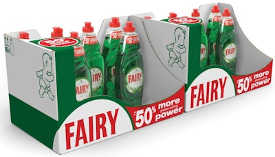
Often the solution to a design/sales problem is staring you right in the face. That’s why you need to make the store shelf your first port of call when starting a project. During this process, evaluate brands in their sales context, be it in store, online, or simply in an ad. What stands out when you walk down the aisles? Is the pack saying, “Buy me”? If not, why not? P&G’s Fairy liquid dish detergent brand, sold in Europe, is a great example of how this process works to ensure a brand shouts louder than its competitors.
During the design process for Fairy’s shelf-ready packaging (SRP), P&G and its package designer discovered that there are some critical ideas to take into account to ensure SRPs work hard and increase differentiation at the point of purchase. Namely:
• Use all pack surfaces—primary and secondary—to ensure a canvas for communication at every angle.
• Prioritize your key message and be big and bold with it.
• Tell consumers only what they need to know at that key decision-making point, and do so in an impactful way to make the brand choice easy.
By effectively dialing up Fairy’s key brand assets, P&G was able to activate those assets to drive sales. The results speak for themselves: After just nine months, Fairy dish detergent sales increased by 4% across Europe, its production costs decreased 50% versus its previous SRP, and its customized display material costs decreased by 50%. Bearing in mind that Fairy is a billion-dollar brand, these are great results.
Yes, retail-ready packaging needs to be functional—it needs to transport and display the primary pack. However, don’t make the mistake of treating it just as a box. Think of it as a stage and add some theatre to the primary pack. This is a view shared by value retailers and discounters, where good-quality SRPs are essential if you want to compete with private-label brands, which often have more space and the best on-shelf position. A change in approach for Fairy’s SRP from technical transportation to in-store theatre has resulted in a commercially viable pack that has markedly increased sales and saved costs.
Drive sales and brand recognition
The messages we convey through design need to be compelling and relevant in their sales environment, and the work Bombay Sapphire and its designer have done in the last few years is a good example of this.
Secondary packaging, in the form of gift packs, is less about function and brand claims. Like the SRP project for Fairy, the design has to stop people in their tracks and make them curious. The ability to delight is also essential, especially in a travel retail context, when consumers have the luxury of time to browse.
The Bombay Sapphire packs designed for global travel retail outlets tapped into consumers’ curiosity, and strengthened their connection with Bombay Sapphire and the brand philosophy of “Infused with Imagination.”
The original project was inspired by an existing print campaign that used crystal sculptures created by Eva Zeisel to depict the distillation process. Bombay Sapphire harnessed this visual and extended it across several retail touch points, including a “Reign” limited-edition gift box using Fresnel lens print technology to create an engaging 3D effect to illustrate the crystal droplet effect. The pack in turn provided inspiration for the POS displays. This package design drove sales and brand recognition in-store with a year-on-year sales increase of 78% and a staggering 220% sales increase in the first month after launch.
The ability to change the gift pack allows Bombay Sapphire to deliver their annual campaigns into the hands of people by triggering the “I’ve just got to have it” emotion on shelf, without altering their iconic, hero primary pack. The most recent iteration of the Bombay Sapphire gift box was the electroluminescent pack design (see pwgo.to/1385), which further strengthened people’s connection with the brand and its philosophy.
Simplify your message to stand out
A constant beacon for the brand is the primary pack, what consumers view as “the product,” and the one guaranteed touch point they interact with. Therefore, it should be the embodiment of your core brand attributes, your unique point of difference that you’ve carefully crafted to blow the competition away. It is key that the primary pack delivers your brand message as simply and delightfully as possible. Creating simplicity isn’t easy, but it has proved worth the effort, since it has created some of the most iconic brand equities.
The structural pack design for U.K. company Westland’s Even-Flo lawn care brand was a project that required the technology to be the star. In fact, the mantra of the structural designer became “to design the Dyson of lawn care.” The design exposed consumers to the mechanics of the pack, on shelf, and reassured them that this was the cutting-edge piece that would transform their garden in the most convenient way. The primary pack does all the talking in-store and is championed in the TV campaign (see pwgo.to/1386).
In faster-moving categories, where the key to success is delivering up-to-date messages that target ever-changing consumer needs, it is all too easy to bombard your iconic primary pack with extra labels that destroy the simplicity of the brand message—for example, “New!,” “30% extra free,” or “More power.” Since its launch in 2012, Even-Flo has driven the lawn fertilizer category forward by offering unique innovation to the marketplace. In addition, year-on-year sales increased by 20%, and significant production and inventory efficiencies delivered a more competitive Cost of Goods Sold (COGS).
If you don’t have the luxury of a large canvas, like the Even-Flo pack, the problem is intensified and requires the wider packaging toolbox to do some of the heavy lifting. If the secondary packaging is doing more of the work, it means that there’s an opportunity to enhance the primary pack, focusing on brand equities and making it a more desirable object to have on display.
Uncover consumer purchase barriers
Often the problem can be more complicated than a mere lack of standout on shelf; sometimes the problem can exist in the consumer’s head. Uncovering these purchase barriers is important in discovering the merchandising and packaging solution that will hopefully drive sales.
For paint brand Valspar, the company and its package designer evaluated the paint-tinting experience in-store, and by working with real people, they gained a greater understanding of Valspar’s needs. Through this process, they learned that consumers were searching for color—not paint. Valspar helped reinvent the category experience with a new focus on shopping for color and mixing tints, which delivered sales growth in tinted paint sales of 112% and achieved a 16% conversion from pre-tinted paint.
Make your brand shout louder
Don’t underestimate the power of visual communication to help your brand shout louder than its share of shelf to compel people to stop, look, and buy. It sounds obvious, but so many brands get it wrong. The design has to be aligned with overarching advertising campaigns and the core brand attributes of the product in order to present a cohesive in-store experience and create awareness of the brand outside of the retail space. It’s true that brands exist in people’s minds, so make sure that the tangible leaves a lasting impression.
Creating shelf impact is also about showing restraint with brand communication on-pack and prioritizing the hierarchy of communication. Simplifying the messaging eliminates the heavy lifting for you and the consumer.
Ronald de Vlam is Global Managing Partner of strategic brand design firm Webb de Vlam (www.webbdevlam.com). He can be reached at 312/575-0700.