Consider the shopping experience today: Consumers squeeze visits to physical stores in between work commitments, feverishly organizing checklists, exercise classes, TED talks, kids’ extracurricular activities, and daily meditation practices (a necessary coping mechanism for dealing with all of the aforementioned activities!). The online experience is similarly speedy: Shoppers swipe and scroll while standing in line for coffee, frittering away time on public transportation, or binge watching.
Therefore, it’s essential for brands to capture consumers’ attention and convey key information within seconds. Couple this with consumers’ increasing appetite for brands to have meaning—to have a higher purpose and make more of us happy through storytelling, giving back to the community, and saving the planet—and it’s feasible to think a rebirthing of the utilitarianism philosophy is afoot.
In a quest to harness new insights and discover the fringe of a new trend, or the refresh of past wisdom, it’s useful for packaging designers to peer through the lens of other design disciplines—for example, product design, architecture, or cartography—to look for similarities or principles that can be borrowed. One discipline that epitomizes the utilitarian ideology is road-sign design. More specifically, British road signs.
In the late 1950s, London designers Jock Kinneir and Margaret Calvert were tasked with designing a road-sign system that would be easy to read and understand in a split second. Kinneir started with the question, “What do I want to know, trying to read a sign at speed?”
The result of Kinneir and Calvert’s exploration was an artfully composed system of coordinated lettering, colors, shapes, and symbols. They created a sleek, modern, universal, time-enduring language that was uncluttered and distinctive.
Borrowed principles: lettering and color
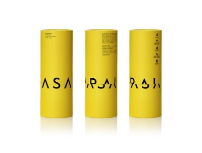
In understanding the design process employed by Kinneir and Calvert, it’s possible to find clear alignment with some current packaging design expressions. An example by the extraordinary design team at Mousegraphics for the Australian-based Asarai brand of natural skincare products beautifully massages utilitarian principles to deliver a fresh, new aesthetic.
What’s brilliant about the design is its use of blazing yellow—not dissimilar to the retro-reflective road signs that leap out at you—which is bold in a category that often opts for white or subdued tones. At first glance, the packaging delivers considered, distilled content: a solid, black brandmark that punches out from the glowing yellow background. But its allure doesn’t stop there. It continues as consumers use the product. The packaging form and mechanics are used to fracture the typography and deliver an intriguing, playful, abstract image. This is a simple, and yet well devised, design that in essence takes a utilitarian principle, but reinvents it to create a design that is experiential and visually delightful.
Furthermore, Asarai’s use of color and lettering echoes the wonderful artworks by Australian sculptor Rosalie Gascoigne, in which she repurposed discarded road signs into powerful assemblages. Discouraging the viewer to read meaning into these abstract images, she instead advised them to focus on “the pleasure of the eye.”
And it is, after all, this “pleasure of the eye” that packaging design demands—design that allures, informs, persuades, and begins our brand affairs.
Picture play
Similarly, Mousegraphics’ work for GAEA vegan snacks uses playful pictograms of each variety’s main ingredient—a gherkin, cauliflower, and a carrot—to express personality, much the same way that Calvert designed her pictograms for signs. For an animal and livestock sign, Calvert’s pictogram was inspired by her friend’s cow, Patience.
Another example of the use by Mousegraphics is its work for espresso brand 96—a design that is truly universal and, as always, clever. The sultry color palette of the coffee bag and a wafting steam illustration evoke the aroma and taste sensation of robust coffee beans. The witty, abstract depiction of the 96 logo—suggestive of espresso cups—brings a smile. This is packaging that, in the words of London brand design firm Lewis Moberly, “First win the eye, then the heart, then the mind.”
Making less, more
How is it possible to reduce a design’s appearance to make maximum impact and maximum sense? One of the best examples of this comes from design firm Jones Knowles Ritchie with its packaging for Domino’s Pizza, comprising two boxes in the brand’s proprietary colors that, when placed next to one another, form a domino. It’s truly iconic. As society has become time poor, over-communicated, and overwhelmed, designs such as this penetrate super-saturated minds—in this case, less really is more. A sharp, simplified message has the ability to stick in the mind and make a lasting impression. But it’s not easy, as many product categories are complex, and let’s face it, less loved, than pizza.
Packaging design today is dynamic, complex, and ever shifting. With each new project comes new challenges as well as ever-greater opportunities. Take cues from other design disciplines, and perhaps start each project with Kinnear’s question, “What do I want to know, trying to read a sign at speed?” PW
Angela Spindler is Founder and Director of Depot Creative Pty Ltd. in Australia.