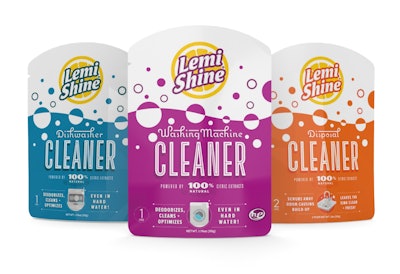
A bright-yellow slice of lemon, effervescent bubbles, and typography with a retro-’50s flair make up the new package graphics for a full line of household cleaning products from Lemi Shine. The Austin, TX-based, family-owned company has been in the business for 22 years, first launching its Lemi Shine Detergent Booster. Since then, it has expanded its portfolio to include more than 10 different products—among them, a multi-use appliance cleaner, a dual-chambered, powder and gel dish detergent pod, and a spot- and stain-resistant surface cleaner—all using 100% natural citric acids.
Recently, Lemi Shine realized the need for a complete overhaul of its brand packaging and look to unify its product categories and differentiate its products—from each other and from the competition—on shelf. The packaging also needed to better appeal to its target audience: younger females looking for non-toxic, affordable, and effective cleaning products that are also safe for the home.
Says Lemi Shine CEO Curtis Eggemeyer, “With the more recent expansion of our product line into household cleaners outside of the dish category, we realized we needed to take a step back and consider a less incremental, more comprehensive change that would accommodate a broader product variation in multiple product categories while still holding together as a single line of products.
“In the end, we wanted the product to better articulate that not only is the product powerful, but it is also safe for the home too.”
Taking up the challenge, creative agency Helms Workshop worked to come up with a fresh, new design that could carry over to a number of product categories as well as accommodate a range of packaging formats, among them custom bottles with shrink sleeves, printed cartons, and stand-up pouches.
The new graphics use three essential design elements: the Lemi Shine lemon logo against a white background, an effervescent-bubble background pattern, and vibrant accent colors that represent each category. Coupled with retro-style typography, the new packaging speaks to the target demographic through a design that evokes a sense of nostalgia and adds credibility while still feeling relevant to modern life.
Eggemeyer admits the new design—which replaced sparsely decorated, yellow and green labels—was so far out of his comfort zone, he almost abandoned the new look. But consumer feedback proved him wrong. “From consumer testing, we learned that the new design better spoke to our target consumer than our old look did, and even our current users preferred it to the old,” he says “It was a big change. But if our consumers were ready for it, it was definitely the right thing to do.”
The new packaging began rolling out in November 2016, with the full line on shelves by February 2017. Lemi Shine’s products are available in grocery and mass retailers nationwide.