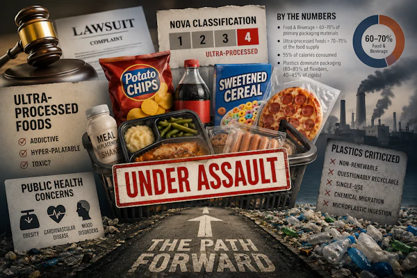
Kimberly-Clark’s Kotex brand is rolling out a full packaging redesign across its portfolio of pads, liners, and tampons. The move replaces a significant portion of its traditional polybag formats with recyclable cartons that incorporate new structural features, better visibility on the shelf, and premium decorative elements.
At the center of the redesign is a shift toward functionality in the home, particularly how consumers open, store, and repeatedly access the product. The updated cartons feature a new dual-panel opening system located on the back of the pack, designed to accommodate multiple storage orientations and usage scenarios.
“We added an easy open and reclose feature on two different panels to provide the consumer with flexibility and easy access to product whether they lay the box flat or upright,” says Chris Bechyne, senior team leader, packaging, at K-C.
The structure was informed directly by consumer feedback around everyday use, particularly the need for secure closure and adaptability across different storage locations in the home.
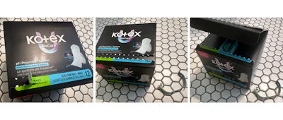
“Consumers told us a secure closure and ability to store in different locations at home was important,” Bechyne adds. The carton’s embossed back panel directs finger placement (demonstrated with a green pen here) to a perforated opening feature; once opened, the dual-panel design creates a wide aperture that exposes product orientation, interior print, and the integrated window.
A notable aspect of the redesign is the transition from flexible packaging to folding cartons across much of the portfolio. The move not only enables recyclability but also introduces new structural and visual opportunities not possible with polybags. Among them is a product window integrated into the carton, allowing consumers to view the individually wrapped pads or liners prior to purchase. This is an uncommon feature in the category, the company says.
“Because she likes to see what’s inside, we made sure the product is easy to view in the window, before buying,” says Kristi Schroeder, design strategy director, K-C.
The cartons also include a hidden interior print element intended to create a moment of engagement at first use, reinforcing brand identity beyond the shelf.
“Kotex brought back the essence of our brand and added a little surprise to spark joy when she opens it,” Schroeder says.
From an engineering standpoint, integrating a window into high-speed, high-volume carton automation required careful attention to structural details and automation compatibility. The team refers to the feature as an internal window, designed not just for visibility but for manufacturability within existing cartoning constraints.
Kimberly-Clark’s Kotex brand is rolling out a full packaging redesign across its portfolio of pads, liners, and tampons. The move replaces a significant portion of its traditional polybag formats with recyclable cartons that incorporate new structural features, better visibility on the shelf, and premium decorative elements.
At the center of the redesign is a shift toward functionality in the home, particularly how consumers open, store, and repeatedly access the product. The updated cartons feature a new dual-panel opening system located on the back of the pack, designed to accommodate multiple storage orientations and usage scenarios.
“We added an easy open and reclose feature on two different panels to provide the consumer with flexibility and easy access to product whether they lay the box flat or upright,” says Chris Bechyne, senior team leader, packaging, at K-C.
The structure was informed directly by consumer feedback around everyday use, particularly the need for secure closure and adaptability across different storage locations in the home.
“Consumers told us a secure closure and ability to store in different locations at home was important,” Bechyne adds.The carton’s embossed back panel directs finger placement (demonstrated with a green pen here) to a perforated opening feature; once opened, the dual-panel design creates a wide aperture that exposes product orientation, interior print, and the integrated window.
A notable aspect of the redesign is the transition from flexible packaging to folding cartons across much of the portfolio. The move not only enables recyclability but also introduces new structural and visual opportunities not possible with polybags. Among them is a product window integrated into the carton, allowing consumers to view the individually wrapped pads or liners prior to purchase. This is an uncommon feature in the category, the company says.
“Because she likes to see what’s inside, we made sure the product is easy to view in the window, before buying,” says Kristi Schroeder, design strategy director, K-C.
The cartons also include a hidden interior print element intended to create a moment of engagement at first use, reinforcing brand identity beyond the shelf.
“Kotex brought back the essence of our brand and added a little surprise to spark joy when she opens it,” Schroeder says.
From an engineering standpoint, integrating a window into high-speed, high-volume carton automation required careful attention to structural details and automation compatibility. The team refers to the feature as an internal window, designed not just for visibility but for manufacturability within existing cartoning constraints.
“The window placement was carefully designed to be fully compatible with the cartoner during carton forming,” Bechyne explains.
To achieve this, K-C optimized glue-application tolerances and engineered precise spacing between carton scores and the window cutout to ensure the feature would not interfere with automated forming. The placement and geometry of the window were also aligned with the folding sequence of the carton, helping maintain structural integrity and consistent performance on the line.
“We aligned the product’s ideal in-carton orientation with the automation sequence to support a consistent consumer experience,” Bechyne says.
These adjustments allowed package designers to introduce new structural features, such as windowing, dual openings, and reclosure, without compromising cartoning efficiency, the company says.
The packaging overhaul coincides with a reimagined lineup of pads and liners, including Ultra Thin, Bamboo, Biocare, and Teen variants, along with Night Defense options, which required corresponding updates to packaging formats. Changes in product form factor drove refinements in both carton dimensions and structural elements.
“Packaging dimensions and structural elements were refined to match the new and improved product forms across the lineup,” Bechyne says.
At the same time, Kimberly-Clark worked closely with key retail partners during development to ensure pack configurations aligned with shelf requirements and merchandising expectations. That collaboration helped the brand maintain a cohesive, consistent presence across a wide SKU range while optimizing how the products block and present at retail. The back-panel, dual-opening feature creates a wide dispensing aperture, with two flaps that separate to allow access whether the carton is stored upright or flat.
The shift from poly bags to cartons also opened up new opportunities on the graphics side. With more printable surface area, Kotex leaned into a design approach inspired by beauty and skincare packaging, emphasizing bold, confident visuals, strong contrast, and a more elevated aesthetic.
“We drew inspiration from her favorite beauty brands and translated that simplicity into the Kotex experience,” Schroeder says.
A key element of the redesign is bringing the Kotex brand more prominently to the forefront, leveraging its heritage while using the iconic “U” design as a telegraphic visual cue to communicate product benefits and differentiate variants across the portfolio.
While the underlying printing process remained unchanged, the transition to cartons enabled the use of additional decorative techniques and a broader design palette. Embossing was introduced to create tactile dimension, while high-gloss accents help draw attention to key brand elements and improve shelf impact.
“This transition allowed for a broader design canvas, resulting in an increased number of colors compared to the previous packaging,” Schroeder explains.
Despite the expanded SKU set, the brand maintained a cohesive shelf presence through consistent use of black as a primary color and structured visual hierarchy across packs.
“Strong black brand blocking keeps Kotex instantly recognizable on shelf, while distinct U-variant differentiation helps her quickly find the product that best fits her needs,” Schroeder says.
Kimberly-Clark partnered with Landor as its strategic brand design partner, responsible for shaping the overarching brand identity and system, while Kay James Design led the development of product-level aesthetics. Together, the partners worked to align structural and visual elements into a unified packaging experience.
Executing the redesign at scale required balancing design ambition with operational and commercial realities, the stakeholders say, particularly given the scope of replacing all SKUs across the portfolio. Kotex menstrual product line featuring Night Defense, BioCare, 5X LeakShield, Teen, and Bamboo variants in new carton packaging.Kimberly-Clark Kotex
“The biggest challenge was balancing the technical requirements and tight timelines while still preserving the core design strategy,” Schroeder says.
The effort also involved integrating retailer feedback and coordinating across product, packaging, and manufacturing teams, resulting in a packaging system designed to function both on shelf and in the home while meeting the demands of high-speed production.