Happy New Year! Or is it? Feeling refreshed and excited about what’s ahead? No? Well neither are other consumers. Not since the last recession are people as tired and as uncertain of what’s ahead. Especially after enduring the polarizing and stressful environment that permeated 2016 with the federal elections. Entering 2017, consumers are ready to move on and, more than ever, start fresh, take a break from politics, and live with less stress…no matter what the new year brings.
In 2017, brands should, and will, take a decidedly more optimistic tone as they become a unifier for fatigued American consumers. During the second half of 2016—beginning with the Rio Summer Olympics, through the election cycle, and into the early holiday season—we started seeing brands ignite the trend of unity and empathize with a stressed-out nation. They came to the rescue, providing a needed mental break, a unifying rallying cry, or a sense of patriotism. In the year ahead, there will finally be more space for discussions and coverage of brands other than “Trump” and “Hillary.”
These themes will only become stronger as brands use limited-edition packaging and messages that encourage consumers to come together over shared experiences, shared stories, and the shared love of friends, family, and community. As we kick off 2017, here are three top brand and packaging trends to watch for, together with examples of successful package designs, and tips on taking advantage of these trends.
Trend #1: Unity
2016 witnessed a deep divide among Americans. While consumers cited political leaders as being out of touch, consumers were just as much at odds with each other. To combat this, some brands tried to convey the message that our country, communities, and people need to be unified. In this spirit, these brands reflected and reacted to what was needed in society from a brand voice and perspective. Both Starbucks and Budweiser stripped their brand names from their packaging and made the American people the focus instead.
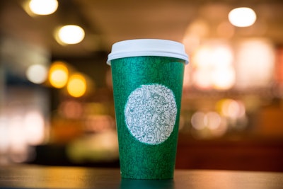
Just a week before the election, Starbucks released its limited edition “green cup,” celebrating both individuality and unity, and reminding us that even in a time like election week, we’re all Americans. The design used the iconic Starbucks white circle and green color as the sole brand identifier, with a mosaic of more than 100 people drawn in one continuous stroke covering the entire cup. Among the figures are a coffee farmer, a family, a barista, and friends embracing.
Said Howard Schultz, Starbucks Chairman and CEO, “The green cup and the design represent the connections Starbucks has as a community with its partners (employees) and customers.During a divisive time in our country, Starbucks wanted to create a symbol of unity as a reminder of our shared values and the need to be good to each other.”
“But, wait,” you say. “Didn’t that campaign receive some significant consumer and media backlash?” Indeed, it did. But, the temporary package design grabbed headlines across the nation as a debate on how consumers preferred their Starbuck’s cup design, distracting consumers—and their anger—during election week. We agree Starbucks may have done a few things to better position the cup and prep the public for this campaign, including letting them know it was not the new holiday cup and having more of an integrated approach to help the message come alive, perhaps through the baristas on the front line.
The Starbucks green cup was a great idea and shift in package design. But it may have served them better, perhaps, to start the campaign at the beginning of 2017, after the holiday season and leading up to and through the Presidential inauguration. This could have helped rally communities around a more dynamic marketing campaign, based upon this unique, “unexpected” custom cup design.
In the case of Budweiser, they catalyzed a trend by sacrificing their brand name—but not the essence of their core package design—for something greater. In this case, America. The can redesign was launched nationwide May 23, 2016 and was sold through the November election with the intent “to inspire drinkers to celebrate America and Budweiser’s shared values of freedom and authenticity.”
For the America can, Budweiser swapped out its own brand name to be as patriotic as possible. From a brand and packaging standpoint, this is pretty unique and brilliant. They replicated each typeface and replaced all the copy on the packaging to fit with the America theme. From a distance (or even at a glance) it looks and feels just like a Budweiser can, with the architecture, color, detail, and iconic script still in place. It’s only when you are aware and really engage with the package that you see all the messaging and details. This created significant word of mouth in the media and among consumers, as they were eager to show how the message of the package redesign was so clever and subtle, yet so strong.
Celebrating and promoting unity is resonating with the American consumer, but timing and delivery is critical. Before designing packaging for your brand that fits this trend, ask yourself:
· Is this an appropriate stance and message for our brand to carry? Is it true to who we are as a brand?
· Would a message of unity in fact alienate any of our loyal consumers?
· Is the timing right? Is there a better time or additional activations we may build in to make it more dynamic?
Trend #2: Being “in the moment”
What’s important to your brand’s consumers should be important to your brand. Period. By developing a deep, strategic understanding of cultural trends and data about your consumers, you can stay steps ahead of your competition. Two of the best examples from the past 18 months are the Chicago Cubs and a “consumer-demanded” product from Doritos.
The Cubs’ run at the 2016 World Series Pennant showed the largest uptick in post-season baseball watching in decades, and is now officially the most expensive ticket sold for a single sporting event in history. People just love an underdog (107 years in the making) and one that inspires, rallies, excites, and gives them hope. Consumers connect with the values of hard work, going the extra mile, and retaining the hope and passion the Cubs showed in stripes.
The Cubs franchise is a case study in how to pull a stagnant brand out of the shadows…and make the most of it in the moment. The Chicago Cubs are now one of the hottest brands out there, and they capitalized on their heritage with a grassroots movement to “bring back” the “W Flag.”
Dating back to 1937, the Cubs Win Flag, or W Flag, is a victory flag flown at Wrigley Field after every Chicago Cubs home win. It is decorated with a white background and a capital W in blue. With the Cubs’ recent victories, the franchise took the tradition and brought it back in a fresh, modern way, making the simple blue W the ultimate symbol of brand success within Chicago, and even beyond.
When the Cubs’ participation in the World Series was imminent, the team’s official partners responded to the rallying call. Dunkin’ Donuts had a W donut for sale, American Airlines sponsored W rally towels, and a healthcare company made W onesies available to babies born in their hospitals. But you know you’ve really made it when a Chicago deep-dish pizza restaurant recognizes you—as was the case with Giordano’s Pizza, which arranged Parmesan cheese in the shape of a W on top of the sauce. Beyond this, the Cubs rode the wave into merchandising, putting out a full line of apparel with the W at Game 1 of the World Series.
No doubt plans are in place for the 2017 baseball season to maintain the excitement of the 2016 season by looking at product and package (concessions, especially) designs that keep the W Flag alive.
In the area of social causes, some of the most cutting-edge brands are taking stands in immediate and imminent ways. Beginning in 2015, select brands embraced the U.S. Supreme Court’s ruling on marriage equality with campaigns that were extended through 2016, leading into the one-year anniversary of that historic ruling.
Dorito’s Rainbow chips is one of the most successful. Through a simple, thoughtful social media post of a one-time product, Doritos introduced a crisp, clean package redesign showing their chips in the colors of the iconic Pride rainbow flag, set against a pure white background. Through the campaign, in which consumers donating $10 or more to the It Gets Better Project received a bag of Dorito’s Rainbows chips, the company was able to generate a groundswell of interest and social support that led to a first-ever, consumer-demanded Frito-Lay product.
Said Ram Krishnan, Chief Marketing Officer for Frito-Lay, “Time and again, our consumers have shown us, there really is nothing bolder than being true to yourself and living life to the fullest. With Doritos Rainbows chips, we’re bringing an entirely new product experience to our consumers to show our commitment toward equal rights for the LGBT community and celebrate humanity without exception.”
By connecting the product and new package design to a social cause and a charity, the Dorito’s Rainbow chips campaign is a great example of a brand taking a social stand with its packaging to connect with its core consumer audience.
To create packaging for 2017 that is in the moment, take some time to consider the year ahead from the perspective of your consumer—or even subsets of your consumer base. Map out potential events and plan to be in the moment when an extremely emotional, important moment happens for communities within your consumer base, with creative tactics to position your brand, product, and package design.
Following are some thought starters inspired by the examples above:
· Develop a simple and sharable icon that consumers can rally around—your “W Flag.”
· Think underdog. Look at energizing issues or moments and take a stand. Then, let your brand advocates take it from there with real-world and social word-of-mouth point of view.
· Have a package design narrative or manifesto for these situations and plan to share it; make a public statement or pledge.
Trend #3: Social by design
Creating a special or limited edition product or package shows consumers you’re listening and makes you a part of their conversation. It literally places your package design into their hands. This process, however challenging it may be for you, delights your consumers and builds a connection to your product. Empowering consumers to be “mini-CMOs” is part of what’s next, as long as you’re empowering them to express their individuality.
The Coca-Cola Company took the trend of socialization to a new level the past two years when, like Budweiser, it stripped its logo to feature first names and wishes of goodwill on its bottles and cans for individual consumers. And, in 2015, they developed additional engagement tactics that were just as fun and personal using limited edition packaging re-imagined to engage and celebrate the holiday season.
In 2015, in many regions of the world, Coca-Cola developed a special label for their primary bottle that, with a simple tug, would transform the flat label into a 3D Coca-Cola holiday bow. The interactive packaging created a buzz-worthy, “refreshing” moment to engage and delight, and transformed a bottle of soda into a gift. An engaging and interactive approach like this not only generates brand excitement, but also allows consumers to experience the brand in a new way and discuss it in real-world and social media forums.
Also in 2015, through their “Share A Coke” program, Coca-Cola enabled consumers to replace its iconic logo on a variety of packages with seasonal names such as “Santa,” “Someone Nice,” “Someone Naughty,” and “Secret Santa.” In addition, the company featured reindeer names such as “Dasher & Dancer,” “Prancer & Vixen,” and “Comet & Cupid” on its aluminum cans. Again, it provided an easy way for their consumers to engage personally through the limited edition packaging.
For national beer brand Blue Moon, the challenge was to make its brand feel like a small, local craft product again, through regional market activation and outreach. Its Artist Series packaging campaign welcomed up-and-coming artists to be brand ambassadors and influencers by having them submit label designs for the brewery’s anniversary.
Culled from an initial list of 500 submissions, 20 artists were selected to create a unique work of art for a limited edition bottle. The brief gave artists free rein to express a story in their medium of choice. The only requirement: a blue moon. The move solidified and expanded the brand’s Artfully Crafted position and pegged it as a brand to watch in craft beer. All participating artists were compensated and were able to gain valuable local and national exposure through social media, press, and local market programming. The top 10 artists who received the most votes on Facebook entered the finals for a chance to win a $20,000 grant determined by a national panel of qualified jurors.
Blue Moon’s Artist Series is a great example of a company momentarily allowing its consumers to become mini-CMOs, invested in designing and buying the limited edition line.
Following are tips for designing packaging that is social by design:
· Ask yourself what would ignite or delight your consumer if you empowered them to help interact with your package design/labeling.
· Tear down your thinking about what’s possible or realistic, and seriously consider the “impossible” to empower and engage consumers in your package design
Keep your package dynamic
One of the most important—and often overlooked—strategies for brand success is to have a package design that is dynamic. Your packaging needs to not only entice consumers, but also engage and empower them to become brand ambassadors, carrying your message long after purchase. To take advantage of the opportunities presented by 2017’s emerging trends, your brand must be more reflective and involved with what’s happening in society—literally engaged through package design. By doing so, you will make consumers feel more relaxed and “lightened” in the year ahead.
Happy BRAND new year!
Matthew Youngblood is CEO and Executive Director, and Erin Paul is Director of Design Strategy, for Trinity Brand Group.