For consumer packaged goods (CPG) companies, product packaging is a vital marketing tool that is increasingly providing the key differentiating factor among brands. Innovations in packaging formats, materials, and functionality are giving brands the on-shelf impact needed to grab consumers’ attention and make the sale.
In the same way, high-volume retailers have turned to packaging to differentiate themselves from their competitors. “Over the last twenty years, stores have come to think of themselves as a brand, rather than as a place,” says John Helferich, executive in residence at the College of Business Administration at Northeastern University. “When you begin thinking of yourself as a brand, you learn that you’ve got to differentiate your brand to be successful.”
When it comes to retail packaging, this shift, he explains, has transferred the “power dynamic” from the CPG companies to the high-volume retailers, which now demand products and packaging that support their brand and fit in with the shopping experience they are trying to create. “What retailers like Wal-Mart are now trying to do is create the demand, rather than fulfill the demand,” says Helferich. “This is a fundamental shift in the way retailers think about themselves.”
While some CPG companies struggle with the challenge of creating unique packaging formats for each retail environment, others view it as an opportunity. Says Don Finney, production manager for Carma Laboratories, the maker of Carmex brand lip balm and a supplier to high-volume retailers such as Wal-Mart, Target, Sam’s Club, and Walgreens, “We are very adaptable, and frankly, the change has been very exciting. I believe that it has absolutely helped us to increase our sales.”
Retailers differentiate
So how did this shift come about? And how are some of the largest high-volume retailers positioning themselves? Helferich, who previously served as the vp of University Research at Masterfoods, says that several factors are responsible for the change. First, the introduction of retail scanning and loyalty cards gave retailers the data to understand their shoppers’ habits better than CPG companies could. Second, consolidation of the industry into supercenters, warehouse club stores, and “category killers” has heightened competition and has driven the need for differentiation.
“For example,” says Helferich, “whoever is competing against Wal-Mart knows that they can’t beat them on price or efficiency, so they try to beat them by creating a different shopping experience, with a different selection of merchandise, presented in a distinct way.”
Wal-Mart, whose tagline reads, “Save Money. Live Better,” has branded itself around the value proposition—the best items at the lowest price, Helferich explains. To achieve this value, it relies on supply-chain efficiency throughout its more than 4,000 U.S. and 2,900 non-U.S. stores. For the 60,000 CPG companies that supply Wal-Mart, this means providing shelf-ready products with the help of packaging such as corrugated trays and displays that require minimal labor to set up.
In addition, the introduction by Wal-Mart of its Packaging Scorecard in 2006 (see packworld.com/view-22320) has sent suppliers scrambling to evaluate and modify their existing packaging for greater sustainability. Elements being examined include such things as product-to-package ratio, use of recycled materials, cube utilization, and others. According to Wal-Mart, when the scorecard officially launches next month, suppliers’ scores will be used by Wal-Mart buyers in their purchasing decisions.
Sustainability drives change in aspirin pack
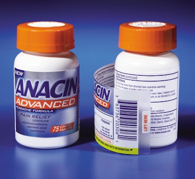
Insight Pharmaceuticals LLC is a good example of one CPG company that made a dramatic change to its packaging to meet the sustainability requirements of one leading national retail outlet. Upon launch of its new Anacin Advanced Headache Formula, Insight was advised that the retailer had reduced the amount of shelf space typically allotted for Insight’s products; Insight was also asked to eliminate the product’s unit carton.
Because its aspirin products had traditionally been presented horizontally in a carton, Insight was concerned that these changes could significantly affect the brand’s positioning and impact. To comply with the retailer’s requirements, however, Insight broke with tradition and presented its product vertically.
“For the retailer, moving our product to a vertical position enables them to slot a broader selection of products,” says Larry Freedman, director of business innovation for Insight. “That’s both a good and bad proposition. For the retailer, it’s all about how many products they can get on the shelf. But it does make it harder for individual products to stand out and get noticed.
“That undercut our efforts to make it easy for consumers to find our product. By placing our product on its side, we had a pretty large surface area that served as a billboard of sorts. That’s why we knew we faced some big challenges going from that to a cylindrical format with a much smaller viewing area.”
As an over-the-counter drug, Anacin Advanced is required to meet stringent regulatory labeling requirements. By eliminating the unit carton, Insight lost the valuable space needed to communicate dosage and drug fact guidelines. It also lost the carrying device for delivering a related carton insert that provided more detail.
To make up for the space lost for copy, Insight specified the EasyTab® extended-text label from WS Packaging Group’s MultiVision® label line. “This was a totally new label configuration that required a much higher level of printing and construction sophistication,” Freedman says. “We wanted a metallic-type finish that incorporated visual elements from the unit carton. But going from a carton stock to a label stock isn’t a turnkey change-out. Especially when the label has to go on a round container.”
The patented EasyTab label design features a pre-curve in the top panel that makes it possible to wrap the label around tight-diameter surfaces. “In order to include all the required text, Insight needed the label to fully wrap all the way around the bottle,” says Paulette Carnes, MultiVision product development manager. “The pre-curve feature is specifically engineered to ensure the label will open and close under normal conditions for the shelf life of the product.”
In addition to life-cycle performance, the prime label had to maintain the brand identity of the original carton, which would continue to be available at other retail outlets. This proved somewhat of a challenge because the material used for the original samples of the metallized label was not available in as timely a fashion as a standard label stock.
Instead, Insight chose a 1.4-mil matte polypropylene overlaminate for the silver-metallized primary display panel to create a tactile feel and matte image. The final base label is a 60-lb white semi-gloss. The finished, split-base, 11-color, pressure-sensitive label measures 2 x 6 in. and is applied using standard labeling equipment.
By eliminating the unit carton, Insight gained a noticeable savings in the cost per package. “There’s always a concern that a brand could lose a certain degree of shelf presence when you take a product out of the box,” Carnes says. “But this brand has done an excellent job with its image. It definitely stands out on the shelf. We accomplished our goal of maintaining the brand’s image while still meeting the regulatory requirements.”
Store brand goes upscale
With Wal-Mart staking out the low-price, value position, Target has taken a different tack: upscale design at an affordable price. On its Web site, the company explains its “Design for All” philosophy. “Great design isn’t reserved for the few. It’s great for everyone to enjoy, every day,” it says. The company notes that this attitude can be seen in the brands with which it partners, the way in which its stores are laid out, and in the way that it continuously improves its own-brand products and packaging to make them not only look better, but also satisfy consumers’ needs and simplify their lives.
“Target has a more premium positioning relative to Wal-Mart,” agrees Helferich. “They are still selling the same sorts of products, but they use design to create a perceived higher value and justify some higher price points.” Because of this, he observes, Target looks to its suppliers for packaging that provides better design.
About a half-dozen years ago, Target launched a private-label food and beverage brand, Archer Farms, that exemplifies its emphasis on design and unique, premium products—a departure from the traditional store-brand philosophy. “In the old days, a retailer would take the leading national brand, imitate its packaging, slap their own name on it, and cut the price by 20%,” Jim Hertel, managing partner at Willard Bishop Consulting Ltd., recently told the Wall Street Journal.
Today, he added, there are premium products priced the same as nationals, but positioned as better or unique because they can’t be bought elsewhere. Archer Farms—now sold in 200 SuperTarget stores nationally—is such a brand. Target spokeswoman Lena Michaud told WSJ: “Archer Farms is a differentiating factor in our stores, and we aspire to have it viewed as a national brand.”
A recent visit by Packaging World to a Chicago-land SuperTarget turned up a treasure trove of Archer Farms products in packaging that in some cases rivals that of its brand-name competition in terms of perceived quality. Among these products was a 10-oz rectangular silver tin for a range of signature blend whole bean coffees. The tin, with an embossed Archer Farms logo on the front panel above a slim, understated label with product variety information that wraps around the body, stands in eye-catching contrast to the colorful, circular steel cans and plastic containers used for competitive-brand coffees.
Also among the finds, a 15-oz, curved, rectangular, clear PET container from Sailor Plastics with a silver, screw-on closure holds unique rice varieties, such as Bamboo and Thai Red Rice. Stand-up, resealable pouches with a luxurious matte finish hold decadent snack mixes with names such as Chocolate Drizzle and Buffalo Wing Savory Pretzels.
In nearly every category, from beverages and snacks to frozen food and bakery, the Archer Farms brand is prominent on SuperTargets’ shelves. Noted the WSJ article, “Target, known for its cheap-chic merchandise sensibility, is attempting to make Archer Farms so trendy, it will be a destination in its own right.”
Club stores speak a separate language
Warehouse club stores—primarily Sam’s Club, Costco, and BJ’s Wholesale Club—are a major force driving packaging innovation in the retail industry. In 2006, worldwide club-store industry sales totaled $120.4 billion, according to the “2007 Warehouse Club Industry Guide,” from HHC Publishing, Inc.
What is most striking in this category, however, is not how much these retailers’ packaging requirements differ from one another’s, but rather how completely their expectations diverge from traditional retail packaging formats. “Packaging is one of the single most important components in the warehouse club industry,” notes the HHC report. “Warehouse club items must be display-ready.”
Among the hallmarks of club-store packaging is the use of pallets—required are constructions of 48 x 40 in., weighing between 50 and 55 lb; clamshell and blister-packs that provide product security and protection; multipacks created with plastic handles and shrink sleeves; unique combinations of products bundled to provide variety; “supersize” cartons; and the use of strong, bold package graphics that stand out in the club-store channel.
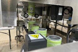
Because the packaging required for club stores is so different than for traditional retail, CPG companies hoping to do business in these environments oftentimes must invest in new packaging equipment. Carma Laboratories, Franklin, WI, is a good example.
As Carma production manager Don Finney relates, it used to be that supplying Carma’s retail customers was a simple matter of shipping the requested number of blister-packed Carmex lip-balm sticks, jars, or tubes to its retailers. Two years ago, the company formed a sales team that now sells unique packaging formats and product mixes to a range of retail customers.
“The change is obvious,” he says. “We never did displays before; we had our basic inner packs that we offered for years and years. But when we launched our outside representation, that’s when the change started. We started meeting the retailers’ requirements.
“It opened up an entirely new area for us, as far as design, materials, our suppliers, making new contacts, and just really jumping on the gun. It’s been very fast-paced, as you might imagine.”
At Sam’s Club’s request, Carma Labs recently developed a 10-piece variety pack—four lip-balm tubes, three jars, and three sticks—suitable for resale by small-business customers. The package comprises a corrugated card upon which are attached, via a removable adhesive, 10 individually blister-packed products. The card is overwrapped with a clear shrink film. For Sam’s small-business customers, the format provides an easy-to-stage display that enables consumers to remove items without tearing the card.
The package was designed for Carma Labs by Xpedx, which also specified new equipment from Glue Dots Intl. that applies the adhesive to the blister-packs. Along with Xpedx, Glue Dots customized the new SynchroDot™ Pro in-line adhesive applicator to meet Carma Lab’s needs.
The applicator is configured to place two dots, side-by-side, on the blister-cards, which are fed to the machine via a custom conveyor and pucks designed to accommodate all of Carma Labs’ card sizes. Once the adhesive is applied, the products are manually secured to the corrugated card and are transferred to a shrink-wrap machine.
Says Finney, “Glue Dots integrated the SynchroDot Pro into our facility quickly, allowing us to ramp up production. The custom solution proved to be cost-effective, and it allowed us to meet shipping deadlines and grow sales.”
Using this club-store packaging format, Carma Labs can create other product mixes and card configurations, if needed, for other retailers.
Club-store treasures
Just as Target has attempted to differentiate itself from Wal-Mart by focusing on style at an affordable price, Costco has positioned itself as providing a more premium selection than Sam’s Club. “Coscto tries very, very hard to position itself as an upscale retailer,” says Michael G. Clayman, president of HHC Publishing, “and they are not afraid to stock just about anything that they feel they can offer their members a value on. They tend to be ahead of the curve on a lot of items.”
A stunning example of the type of product that can be found in Costco is a sleeved six-pack of Premium Skinless & Boneless Wild Alaskan Salmon from Bear & Wolf Salmon Co., Seattle, WA, that uses the entire sleeve as a billboard for elegant brand graphics. As Bear & Wolf co-owner Seán O’Leary explains, the multipack was developed specifically for Costco, which specified a format of six cans stacked upon one another and bundled with a shrink label.
Unlike most cans used for tuna and salmon, the Bear & Wolf brand uses a tapered can, the Standard Skinless Boneless 307 X 112 can from Crown, which enables Bear & Wolf to ship empty, nested cans to Alaska, where product is filled fresh. The package designer for the product, Lance Kearfott of Giordano Kearfott Design, explains that part of the reason a clear shrink sleeve was not used to bundle the cans was because it would have been cost-prohibitive for the copacker to align the cans before labeling. Using a 10-color, flexo-printed, 50-micron polyvinyl chloride label, from Fort Dearborn, means that cans are not visible under the sleeve.
“We were also trying to expand the amount of real estate for visual impact on the shelf,” says O’Leary. “Everyone says the package is pretty spectacular.”
Clean, elegant artwork—including a white background, a silver banner for the logo, and tasteful product photography—was chosen, relates Kearfott, after considerable market research. “We found that it is the women who buy most of the canned salmon product,” he explains. “And the products that are on the market right now appear to be geared more toward the male segment. There’s a lot of black, there’s a lot of red, and for some reason, historically, that has been the graphic platform for this type of product.
“So we really went in the opposite direction; we gave the package a white look and a more upscale appeal for feminine markets. We put food photography on the label, gave it a silver graphic treatment, and overall, made the packaging a bit friendlier.”
The premium salmon product, priced at $13.79 per six-pack and available only at Costco, has been “flying off the shelves,” says O’Leary, since its release in early 2007.