Iconic British beverage brand Ribena from Suntory Beverage And Food GB&I has undergone a substantial packaging renovation across four of the lines in its product portfolio. With a history reaching back to 1938, Ribena is the U.K.’s number-one juice drink. Known for its rich and fruity flavor, the beverage is made with British-grown blackcurrants and accounts for 90% of Britain’s blackcurrant crop.
Over the course of two years, Ribena worked closely with London-based design and innovation company Seymourpowell to create a new package design that would cement the brand’s future position within the competitive and dynamic beverage category, while retaining the identity consumers know and love. Ribena also wanted to boost its existing sustainability credentials, building on the fact that its bottles have been made from recycled PET for more than 13 years.
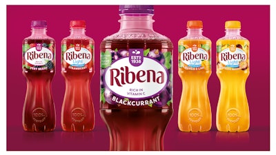
 Ribena Ready to Drink BEFORE (l.) and AFTER the redesign.
See: Tampico Graphics Get Some Punch with Redesign
Using this strategy, Seymourpowell redesigned the graphics and structure for Ribena’s Ready to Drink line to appeal to an ever more sophisticated market and audience, while maintaining heritage elements. The new design evokes the idea of cut glass, adding greater elegance to the product and broadening its appeal to new audiences. Natural cues were enhanced to promote the fruity taste of the juice by introducing illustrations of fruit nestled around the Ribena brand mark, while a transparent, compact label reveals the beautiful color of the beverage. Ribena’s heritage identity was amplified in the redesign, with the company’s “Estd. 1938” message elevated to the top of the brand mark to provide a quality seal.
The sustainability of the packaging was also enhanced through a 50% reduction in the size of the label to aid in bottle recycling. Although Ribena’s PET bottle has always been recyclable, the dark color and the length of the existing label prevented the sensors at some recycling plants from identifying the bottle underneath, preventing those bottles from being sorted into the plastic waste stream. With the reduction in the label size, the bottle can now be recycled with the cap and sleeve on.
Sustainable messages have also been laced throughout the pack: a green leaf mark calls out the bottle’s sustainable properties, while an embossed “recycle me” message on the bottle’s neck serves as a call to action to consumers. According to Seymourpowell, the resulting redesign makes Ribena the largest brand in its category to use bottles that are both fully recyclable and made from 100% recycled plastic.
See: Morton Salt Package Gets Sleek, Ergonomic New Design
The project also included new designs for Ribena’s Botanical Fruit Cordial, Core Squash, and No Added Sugar product ranges. For the botanical line, Seymourpowell opted for a softer color palette and textured paper for the label, which features illustrations of fruit and botanicals to provide lighter and more natural cues for the consumer. Gold accents elevate the occasion, suggesting the premium offering of this drinking experience, and the label highlights the unique flavor pairings of each drink—White Peach & Hibiscus and Crisp Pear & Rose.
 The Botanical Fruit Cordial line features a softer color palette and textured paper for the label.
 Ribena Core Squash BEFORE (l.) and AFTER the redesign.
 A lighter offering to the wider range, the No Added Sugar line is lower in calories and sugar.
Ribena’s redesigned packaging began rolling out across U.K. supermarkets in November 2020.