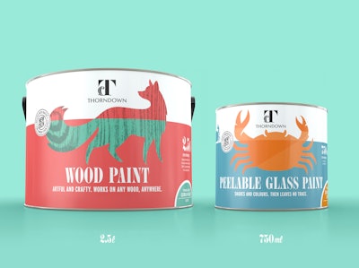
Bright and quirky, branding for new U.K. outdoor paint brand Thorndown was wholly inspired by the start-up company’s origins in The West Country, England—a place known for its creativity and pragmatism, its outdoor lifestyle and changeable weather, and for having the best of both city and country life. Departing from the unimaginative and predictable graphics of traditional outdoor-paint packaging, Thorndown uses silhouettes of animals associated with the West Country—a fox for wood paint, a crab for peelable glass paint—combined with a color palette that draws on the vibrant colors of the orchards, gardens, and fishing boats found in that area.
Brown&co created the Thorndown naming, corporate identity, and packaging design. Its goal was to craft a more design-oriented and aesthetically-considered brand that could elevate the entire category.
“The outdoor paint market is saturated and addresses purely the functionality of the products,” says Troy Wade, Designer, Strategy Head, and Co-Founder of Brown&co. “Not only that, at point of sale, range navigation and messaging tends to be confusing and cluttered, with uninspired brands struggling to differentiate themselves. The client approached us to create a new brand from scratch that would stand out in this crowded and bland marketplace.”
Beginning with naming, Brown&co chose Thorndown to capture the combination of art and science found within the brand’s outdoor paints. “The family behind the paint is the Thornborough husband-and-wife team,” says Wade. “Thorns are hardy, practical plant structures. Down is soft and delicate. This ethos was transposed to the logo, with its sharp, strong ‘T’ and its down-feather accent.”
The animals and icons that replace the imagery of sheds and fences typically used to sell outdoor paints will also serve to differentiate sub-variants as new products are introduced. Along with different secondary label colors, these sub-variants will be identifiable by the position of the animal. For example, Wood Paint for Fences might show a fox jumping or digging, while Wood Paint for Floors might show a fox curled up sleeping. The current Wood Paint line, in a range of colors and finishes, shows the fox standing upright.
Wade says the animals also echo the environmental aspects of the paints, made predominantly from natural pigments and oils and free of chemicals where possible.
Another aspect of the packaging that sets it apart from its competitors on-shelf is the can’s dimensions. “One of the lead designers at Brown&co is an avid painter. He questioned why tins always come in standard sizes, which he thinks are impractical, and he also hoped to design something that would stand out from the crowd,” explains Wade. “After thorough research, a shorter, fatter pot is now being produced that boasts practical benefits for users, like a wider opening for paintbrushes.”
The cans come in three sizes: a 150-mL sample size measuring 74 x 55 mm, a 750-mL size that is 113 x 100 mm, and a 2.5-L can measuring 176 x 120 mm. A larger size, possibly 5 L, will be introduced in the future. According to Wade, despite its unique shape, the new can size was created with zero extra cost in the manufacturing process—a huge advantage considering Thorndown’s start-up budget.
For the can lid, Brown&co created a roundel logo that, despite the cost, was considered a necessary luxury that would add a premium feel to the brand and packaging. Because Thorndown could not afford to produce a different-sized embossing tool for each lid size, a single tool was created that works proportionately for the two larger sizes. For now, the sample size does not have an embossed lid.
Also adding a premium touch, the can uses a pressure-sensitive satin-finish synthetic paper label, printed in four colors on a digital press. As quantities increase, Wade says Thorndown will most likely chose a different label stock, print in litho, and perhaps even introduce spot colors and/or varnishes. Information on the specific paint color and finish is printed on a separate paper sticker manually applied to the can along with the barcode during the filling process.
The brand was launched in February 2018 and has had “overwhelmingly positive feedback from journalists and retailers,” Wade says. In addition, a hugely popular U.K. TV show, “Love Your Garden” has agreed to only use Thorndown paints on its show, “providing brand exposure to millions of viewers each week, all for the cost to Thorndown of a few tins of paint!”