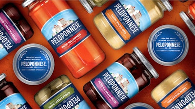
Picture yourself in the sun-drenched village of Peloponnese in Southern Greece, with the blue Mediterranean ocean and rustic hillsides surrounding you. That is the feeling international brand and packaging design agency Bulletproof worked to evoke with the redesigned packaging graphics for Source Atlantique’s Mediterranean food products. Source Atlantique is a New Jersey-based specialty importer and distributor of international food brands. Its Peloponnese line of Greek and Mediterranean products includes olives, spreads, grape leaves, roasted sweet peppers, and sesame tahini, among other items.
While products in the Peloponnese line have earned a reputation as being among the finest, most authentic Mediterranean cuisine in the world, the brand’s former packaging was not reflective of the passion and skill that goes into the production of the artisanal range.
“The previous Peloponnese packaging was a product of a bygone—and less-effective—era of graphic design. It was an amalgamation of overly complex design elements that failed to print properly and as a result, gain the necessary distinction on shelf,” says Bulletproof. “On a basic brand level, the vibrant soul of Peloponnese lay hidden beneath layers of artifice. The branding lacked pop at shelf, and a poorly crafted watercolor illustration was based on outdated visual codes of foodiness and premiumness.”
Source Atlantique’s goal with new package design for its 14 product varieties was to establish the brand as a leader in its category, appeal to a new generation of consumers looking for culinary adventure, and create a system that would make product navigation easier for consumers.
Working from a platform of “Heartfelt Foods,” Bulletproof created a new brand identity designed to strengthen the core equities of the brand, including the village of Peloponnese, redrawn in a more contemporary style. “We reimagined the distinctive brand asset of the hillside Peloponnese village by simplifying and amplifying its inviting charm,” explains the agency. “The sun-washed stone walls, the terracotta roofs, and the faint silhouette of the rustic hillside all hint at the allure and history of the region.”
To make it easier for shoppers to navigate the portfolio, each product variety is clearly identified within its own brightly colored “plaque,” just below the Peloponnese logo, both of which are set against a dark blue background. Bulletproof notes that the colorways of the design were chosen to give the brand maximum standout at shelf, with the contrasting use of bright blue and dark blue on-pack to create an impactful brand block. Says Bulletproof, “The findability and shoppability metrics are off the charts, ensuring the Peloponnese line is future-proofed for new products.”
The products’ pressure-sensitive labels are offset-printed in five colors plus a matte or gloss varnish.
The redesigned packaging was introduced in retail stores in February 2017. The Peloponnese brand is sold in supermarkets and specialty foods stores such as Publix, Stop & Shop, ShopRite, Harris Teeter, and others.
Concludes Bulletproof, “The new design aesthetic speaks to a more colloquial and authentic tone of voice. A simple, handcrafted logo and bright Mediterranean colors offer a uniquely warm smile at the shelf…inviting everyone to share in the warmth of the Peloponnese table.”
