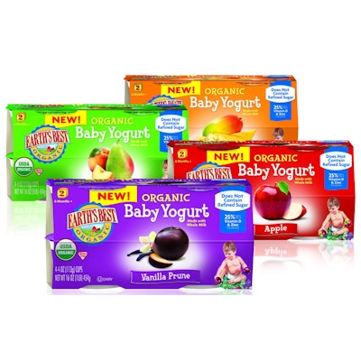
Hain Celestial’s 25-year-old Earth’s Best baby food brand is marketed as delivering the highest level of purity and freshness, “to ensure that babies can grow up healthy and strong.” In developing a package design approach for the company’s new line of Organic Baby Yogurt in four flavors, Smith Design was challenged to create graphic imagery that could leverage the inherent equities of the Earth’s Best franchise, strongly communicate flavor, and differentiate the product from other baby and toddler yogurt brands.
“Creating a line extension for an established, heritage brand that enters an entirely new category is a very exciting challenge,” says executive vice president of Smith Design Martha Seidner. “The advantage is that you can leverage the visual equity that already exists and consumers recognize. That provides instant credibility to the new launch. However, this can also mean you may be locked into an existing design system.”
Lucky for Smith, the design system was one of its own making, as it recently completed the package graphics for a line of Earth’s Best baby food purees. Elements carried over from the puree packs include the use of bold color cues to differentiate flavors, photorealistic imagery of fresh fruits, and a baby illustration that helps quickly define the appropriate age stage for the product. “This product is designed for babies moving to new food after six months, so it requires the ‘nurturing’ or even nostalgic aspects of the Earth’s Best brand to reassure mom that this is pure, natural, and healthy for baby,” says Seidner. The chosen typography adds a touch of playfulness, she adds, “but does not detract from the premium quality attributes of Earth’s Best.”
To ensure maximum shoppability and shelf-impact for the product, which is often stacked low in refrigerated cases at retail, Smith Design placed key information on the top panel, placing photographic flavor cues close to the center of the panel.
Earth’s Best Organic Baby Yogurt—in Vanilla Prune, Apple, Banana Mango, and Peach Pear flavors—was introduced last July to supermarkets nationally in a 4-oz multipack with a paperboard sleeve, six-color litho-printed by Proteus Packaging.