For design strategists Beardwood&Co., a lack of brand identity for 30-year-old deodorant brand SURE, now owned by Idelle Labs, provided a blank canvas for a revitalization of the brand and its packaging. In mid-2011, Beardwood was hired by Idelle to “evolve the packaging to inspire desire at shelf without alienating existing customers,” explains Beardwood Managing Partner Ryan Lynch.
“We conducted research following our first round of design exploration. We took a number of concepts into qualitative research, but started each discussion with consumers about the equities of the brand and what they could remember about it unaided,” Lynch adds. “In most circumstances, there was little equity beyond the name and their association as having a great unscented variant.”
SURE was introduced in 1973 as a unisex product—a somewhat foreign concept to today’s personal care consumers. “Another big insight from our research was that while both men and women currently used the product, there is an expectation that deodorants are gender-specific,” says Lynch. “Therefore, something unisex will not be perceived as effective as a product that is gender-specific. SURE’s customers were women, and the brand needed to commit to this group to keep them and bring new users.”
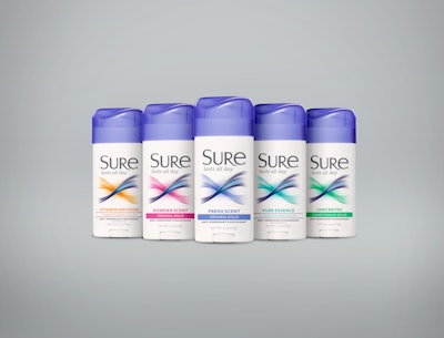
Based on that research, the design team, led by Beardwood Partner/Creative Director Sarah Williams, went to work creating a balance of white space and color, with cool tones that pop, yet are sophisticated. At the core of the design is a new logo with a strong, modern typeface and a new icon—an infinity symbol, chosen to signify that the product really works. The five fragrances in the SURE line are distinguished by bright pastel hues.
To deliver a premium perception, Beardwood developed a custom cap, which Lynch says is a relatively inexpensive way to add a custom impression to a stock package. The shape of the cap—a pastel purple-colored PET closure—is inspired the new infinity icon, creating a considered approach.
The new SURE brand identity was unveiled in summer 2013 to positive consumer response. Says Idelle Senior Director, North America Rick Cutler, “We’re confident that our new identity and packaging for SURE will be a winner on shelf and will not only bring back former customers, but will also encourage trial by new users as well.”