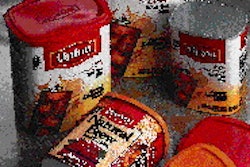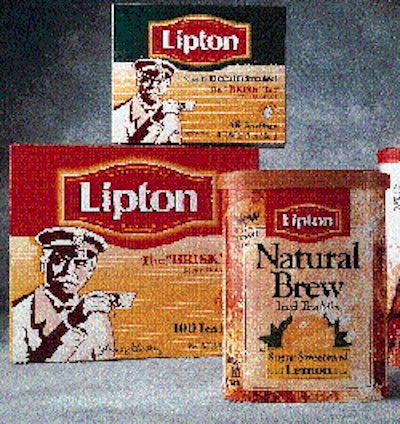
Along with unification, Gerstman+Meyers wanted to elevate the visual image of the brand to the quality level that consumers perceive. The first step was the design of the new Lipton brandmark. "The objective was to create one worldwide tea brandmark. Therefore we updated and melded the international and U.S. brandmarks," says Juan Concepcion, creative director at G+M. A new modern typeface for the logo is surrounded by a red cartouche with a "glowing" yellow border. The shape echoes Lipton's international brandmark, and helps convey a warmer brand identity. For folding cartons of tea bags, the graphics feature a prominent illustration of Sir Thomas Lipton and his signature, but retain the typical colors from the past. The new logo is boldly presented. The back panel of the new boxes shifts from copy to a duo-tone illustration of a tabletop tea set with a modest description of Lipton's history and philosophy. For the powdered mixes, the major change was to focus on refreshment. A splash of tea coming out of the pictured glass gives these labels a lively look. c