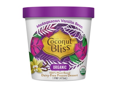
A “divinely creamy dessert,” Coconut Bliss dairy-free ice cream was made from plants long before millennials and Gen Z drove the recent invasion of plant-based foods on retail shelves. Made from coconut milk—chosen for its natural, creamy nature—Coconut Bliss ice cream products were introduced by the Eugene, OR-based company in early 2005. Coconut Bliss offerings include ice cream in pints, ice cream bars, and ice cream cookie sandwiches that are USDA Certified Organic and Non-GMO Project verified. Every product is also certified vegan and gluten free.
Despite its proven plant-based cred, the recent explosion in competition for the plant-based, dairy-free consumer caused the company to rethink its decade-old branding and packaging. “We needed to reestablish our expertise in the category with authority for loyal consumers and create ‘shelf pop’ for new audiences,” explains Coconut Bliss Director of Marketing Darcey Howard.
The redesign, done by Revolution Design Group, carries through the exotic nature of the brand’s ingredients while adding flavor cues, sourcing indicators, and culinary inspirations, all meant to reflect the super-premium quality of the company’s creations, says Howard. “The evolved packaging was designed to visually reflect the vibrant, rich taste and high-quality ingredients of each Coconut Bliss product,” she adds.
Replacing a scroll-patterned background, brightly colored illustrations of coconut leaves now surround the logo along with images of the raw ingredients, such as cubes of caramel, cherries, and coffee beans, found in each flavor. For the new logo, Howard says Coconut Bliss retained its “signature bindi shape,” simplified the graphics, increased the prominence of the words Coconut Bliss, and used a solid-gold background to signify the brand’s premium status.
“The goal was to push ourselves to create a cohesive new design reflecting the passion, purpose, and taste of Coconut Bliss that has made the company a staple in the plant-based industry,” says Howard.
Along with the relaunch of the packaging in March 2019, Coconut Bliss also pioneered another plant-based first: the use of a biopolymer-coated ice cream board, Sentinel™ from Evergreen Packaging, for its pint packaging. Explains Howard, Coconut Bliss is always looking for ways to operate with the highest standards of sustainability, and being the first to use a lining derived from husks of sugar cane seemed like the next level in supporting its mission.
Coconut Bliss worked with converter Stanpac to develop the packaging, which replaces the traditional polyethylene coating used on ice cream board for a moisture barrier to one made from sugar cane—a fully recyclable and renewable material that provides the same barrier. Explains Howard, “Sugar cane is one of the most efficient crops for capturing carbon from the air and incorporating it into its plant structure. By switching from traditional PE made from fossil fuels to PE made from the sugar cane plant, our carbon footprint is reduced,” capturing an estimated 57,393 lb of CO2 from the atmosphere.
Another environmentally beneficial feature of Sentinel Renewable Ice Cream Board is that the paperboard itself is Sustainable Forestry Initiative (SFI) chain-of-custody certified, meaning that the trees used in the papermaking process come from responsibly-managed forests.
Although switching to a biopolymer-coated board has resulted in an increase in packaging costs for Coconut Bliss, Howard says the company worked with Stanpac “in the hopes that more brands will get on board and drive that cost down.”