A design that is flexible enough to accommodate regional preferences, yet rigid enough to ensure a harmonized identity across the globe: that was the challenge set before Hornall Anderson UK when PepsiCo’s Frito-Lay division appointed the design firm in fall 2011 to create a new global brand identity for its popular Doritos-brand tortilla chips.
According to Alastair Whiteley, creative director for Hornall Anderson UK, before the rebrand, international and U.S. packaging for Doritos had two disparate brand identities and multiple packaging variations. “We needed find a solution for this global brand inconsistency,” he explains.
Other goals were to activate the brand narrative, improve the relevance of the brand for today’s global consumer, and reestablish Doritos’ category leadership and cultural distinctiveness. The starting point for the project was an in-depth study of the brand’s core demographic—teens and young adults. This included observing shoppers in the retail environment, at stores in major cities around the world.
“Shopping environments and packaging expectations can be totally different across the globe,” says Whiteley. “Seeing how the brand functions around the world makes you realize the every detail is important. We sought to establish what was unique to Doritos and how to best achieve an emotional connection with their core demographic.”
The firm also analyzed key graphics trends in gaming, sports, beer, grooming, fashion, and music, from which it learned that “the Doritos target consumer moves fast,” says Whiteley. “We knew when it came to redesigning the packaging, every element needed to have a valuable, well-defined role. For the overall Doritos brand identity, there needed to be a clarity and a boldness that would resonate.”
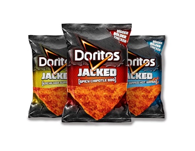
The resulting package design was selected to create a harmonious and globally deployable visual translation of the brand and the brand purpose: “Ignite You.” The new logo comprises the Doritos name intersected by an electrified triangle graphic—which morphs the U.S. spark and the international triangle brand elements into one—to deliver the bold and dynamic aspects of the positioning, while also drawing on the “D” of Doritos and the chip shape. Chip photography is used as a core visual element on-pack, while the packaging has been simplified for a more vibrant look and feel.
One example of how the new package design offers flexibility for regional requirements is the packaging for DORITOS in the U.K. Whiteley explains: “In the U.K., the sharing occasion is of particular importance, so the design had to deliver a strong association between Doritos chips and dips. The end result includes imagery of the chips actually being dunked in the dips on-pack, where in other markets, the dips are not included.”
Having a consistent global presence offers advantages to both the brand and to consumers, Whiteley relates. For Frito-Lay, by focusing on its overall brand story first and foremost, other areas of marketing, such as advertising, social media, etc., will become more streamlined and efficient as well.
From a consumer standpoint: “Consumers have become more global, and so they expect their favorite brands to do the same,” says Whiteley. “No matter where in the world a brand lives, success comes when consumers can instantly and intuitively recognize and assign meaning to it. Packaging serves as one of the key filters through which consumers experience the brand, so there needs to be a sense of consistency and relevance, no matter where you call home.”
Taylor Jenkins, Doritos brand manager, says, “We are thrilled with the new design, as it is our first step toward embracing a unified global positioning for Doritos. Our design has been elevated to combine the global energy with social share-ability that we feel will break through with our core consumer.”
New Doritos packaging for 25 SKUs launched in March in the U.S., the U.K., and Mexico, and is continuing to roll out in other parts of the world.
