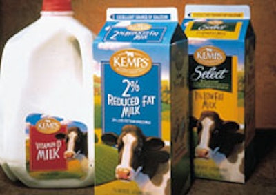
The remainder of the redesign was in the hands of Compass Design (Minneapolis, MN). Labels and cartons, prior to the redesign, were simply two colors, depending on fat content. They were also fairly nondescript. So Compass set out to create a premium look instead. This they accomplished by moving from two-color line art to four-color process printing for both labels and cartons. As for the beloved Kemps cow, it’s still prominent on the new packages. “They have incredible equity in that cow,” Tom Arthur of Compass says. “We were happy to work it back into our designs.”
Companies in this article