Shoppers increasingly are paying attention to the back panel of packages. They may be interested in reading critical product information such as ingredients and calorie counts, but the back panel provides other opportunities that Julia Beardwood, founder and partner at Beardwood & Co., says many products are neglecting.
“Just as with Sports Illustrated models, an outstanding packaging backside is worth the effort lavished upon it on through the rewards of attention gained and appreciation received,” Beardwood says. She lists five best practices of back-panel design:
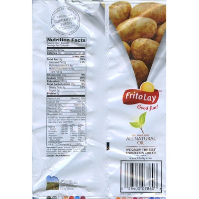
1. Less is truly more. You might have room for 200 words, but that doesn’t mean you should use more than 20. Let your design “breathe” and give consumers the space they need to easily find what interests them about your product. An example is Lay’s Potato Chips, which includes plenty of white space surrounding the nutrition panel. The few visual elements support the message of “good for you” with fresh potato imagery, a “Guaranteed Fresh” stamp, and an “All Natural Oil” leaf icon.
2. Focus on consumers’ needs. A common mistake is making all information the same weight—eight-point type. Smart marketers go beyond offering a list of ingredients by highlighting the most important aspects of their product. Olay demonstrates this point on the back panel of its Total Effects product line. A prominent graphic number “7” echoes the seven signs of aging, which are detailed within a gold bar on the back panel.
3. Have some fun. Beardwood explains that cereal brands have long understood the value of entertaining consumers, yet most brands in other areas of the store have failed to follow suit. Lots of opportunity exists to engage shoppers in a fun way, especially for snacks and beverages.
4. Strike up a conversation. “If someone cares enough to look at the back of your package, what a great opportunity to invite them for a chat,” Beardwood says. This is accomplished by building a real-life relationship rather than merely attempting to conduct a hard sell.
5. Use the element of surprise. Engage them with something that will hold their attention, as Art in the Age liquors did with illustrated ingredient stories on the back panel to bring meaning to the brand name while also educating consumers on the contents of recipes infused with the brand’s spirits.