Savvy consumer packaged goods companies know their brands and their consumers intimately. Package designers and food photographers alike must have an equally intimate knowledge of the brand, the brand's competition, and the target consumer as they develop the visual “feel” of a brand's packaging. All elements must stay within the brand's character. We communicate a brand's “character” via a balance in graphics, typography, color, and an image. It works the same way whether the image is an illustration or a photograph. Depending on the character, the photography can be fun and playful, warm and inviting, light and fresh, or sinfully indulgent.
Kid's cereals and frozen novelties are good examples of fun and playful packaging. The objective is to appeal primarily to kids (while also gaining mom's trust). Warm and inviting images are more likely found on packing for dinner entrées, coffee, or specialty pizza. Lean Cuisine provides a light and fresh take-away, accomplished by using white plates, white backgrounds, and minimal propping in the photo images.
At the other end of the spectrum, indulgent products, like premium chocolate or desserts, rely on rich, dark, and highly detailed imagery. Ingredient visuals typically support these images to convey taste and a feeling of reward or luxury.
Who are your consumers? What types of magazines do they read? What do they watch? If your audience is composed of people who read Gourmet, Bon Appetit or Food and Wine, and who watch the Food Network, then they may be more open to contemporary or cutting-edge images. On the other hand, these images might not appeal to the “meat-and-potatoes” crowd.
Consumers who buy organic products usually read magazines that show food in more natural environments. Backgrounds are photographed out of focus and with natural styling, (i.e. there are crumbs on the plate, and the food looks like it's in your kitchen, not Betty Crocker's). Pro-organic consumers relate this style of photography to healthful, natural products. This approach also works as a strategy for product differentiation.
Who is your competition? How are you different? Can you show that through your package? Call attention to your product by creating images that are more appetite appealing than those for competing brands. You can also add simple props and backgrounds that correlate to your brand's essence and resonate with your target consumer.
Consider Steak House Choice Pub Style Burgers (an Albertson's private-label brand). These are expensive, high-quality products, and the photograph is the key asset on the package that communicates this quality difference to consumers. The packaging photography features rich, dark, wood backgrounds that consumers associate with a premium steakhouse. Complementary lighting amplifies the texture and the moistness of the meat while also creating dark shadows to make the product seem bolder. The angle of the light focuses attention on the product while illuminating enough background to provide a sense of place. Everything in the photo has to work together. Even the type of bun was chosen based on the style the photographer wants to create. The square package shape helps to separate this product from competitors.
With a new product introduction, it may be just as important to educate consumers about how to use the product, as it creates the appetite appeal that invites trial use. Packaging for Jimmy Dean Skillets includes meat, potatoes, and vegetables; the consumer just needs to add eggs. To help the brand owner create a defining package image while also instructing the consumer how to prepare the product, the package features a photograph of a complete cooked meal in a skillet.
Advances in packaging materials and printing techniques are giving brand managers more latitude for using mouth-watering photography on uniquely shaped packages. The primary challenge is working within the layout dictated by the shape. Distortion issues, such as the challenges of maintaining sharp images on curved bottles, are dealt with mainly during pre-press.
The choice of printing process and the packaging surface may also affect how a photographer approaches a packaging photo shoot. Some lesser-quality printing processes could require the photographer to provide an image with higher contrast. In the process, small details may be emphasized less in the printed image.
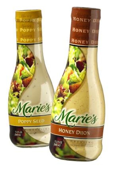
Marie's Salad Dressing faced the challenge of decorating an unusually shaped bottle with a full-shrink label. The goal was to create an image that the consumer could immediately identify along a narrow band down the side of the bottle. Digital images are easier to place in a layout, to see how things are fitting. This process also helps at the pre-press stage for making adjustments when using various methods of printing, and that was the case with the salad dressing label.
The image for Marie's sells a product without actually showing it in use. The salad in the photo doesn't have dressing on it, but the dressing can be seen through the clear bottle, and the brand name is printed on the label. Appetite appeal is created with the image of the salad (the same image can be used across the entire product line).
What makes this image so appealing is that only part of it is in focus. The look is created photographic by using selective focus. Not every leaf of lettuce, nor every crouton, needs to be seen in sharp focus to recognize that it is a salad. In fact, when we allow our mind to imagine, or “fill in the gaps,” we envision this salad as even more appealing than it actually is. We follow this same mental process when viewing an old photograph. We begin to imagine what else might have been occurring in the photo. We project our experiences and dreams into the image to help fill in the blanks.
The process of creating images that consumers find irresistible is challenging. To be successful, you have to choose the right photographer. Select someone who specializes in food photography and has a proven track record with other consumer packaged goods brands, someone who has a relationship with many different stylists, and (both for food and props); someone you can collaborate with, rather than a photographer who would dictate the outcome. Welcoming your packaging photographer as a partner and sharing the brand vision is paramount.
We live in an image-driven culture that exposes thousands of images to us every day. To make your brand stand out in a crowd, it has to communicate to your consumer in a memorable way. And do so in a way that can't be confused with your competition. Great food photography does that.
Teri Campbell is a former photographer for Procter & Gamble's in-house creative group. His studio handles packaging photography for companies including P&G, Kellogg's, HJ Heinz Co., Campbell's, and Kroger.


