Here at Equator, we use every tool possible to gain insight into packaging trends, and this includes examining the elements seen in festive food packaging each year. Not only does this help us gauge what’s achieving the greatest shelf standout (and best sales figures), but it also helps to inform our designs when Christmas approaches once more.
Despite the impact online shopping has had on sales figures, the festive trading quarter is still one of the most important periods on retail’s yearly calendar. It’s a prime opportunity for brands to assert their short-term visual identities and, by using packaging that’s more colorful and more exciting, achieve greater on-shelf standout and inspire customer loyalty.
The season provides all the backdrop needed for drama: light and hope against the darkness and the mystery of winter. It’s no wonder creative minds go for broke this time of year.
At Equator, we examine international trends to discover the very latest in style, photography, packaging, and point of sale. We then use our research to instruct our design, texture, and patterns as these trends permeate down to the high street.
Colors and motifs
Taking as our sample eight major U.K. supermarket brands, we noticed a number of trends.
Our festive color wheel revealed that red is still the color consumers most identify with Christmas. However, when we compared the trends among standard-tier private-brand products versus those in the premium tier, the palettes differed significantly. The standard-tier products demonstrated a tendency toward red and used traditional snowflake patterns, while premium products tended toward darker colors—grey, navy, and dark purple—with subtle dot patterns to suggest snow or stars, lending a more sophisticated look.
This two-tiered approach continued when it came to photography. The core private-brand product photography was generally shot at a three-quarter angle, with warm tones and softly focused backgrounds. However, photographs were often shot from above for the premium products, giving off a much moodier feel, with shadows and darker tones. Not “cheap and cheerful,” but a lot more seductive.
Themes varied, but among those most popular were:
- Holly, along with spruce and mistletoe, giving a sense of nature
- Pure luxe: Bold and dramatic, yet simple and minimal; fonts are direct and unadorned, while finishes can be metallic and tactile
- Celestial: With the 50th anniversary of the first moon landing upon us, many are looking to the heavens for inspiration
- Scandinavian folklore: Fun and friendly approach, great for children; creative patterning lends a traditional feel
- Party vibrant: Fashion-inspired, this trend is largely targeted at millennials, uses eye-popping colors and lots of glitter; think excitement, glamorous presents, and parties
Supermarket scorecard
The three brands that achieved the highest Year-Over-Year sales were Aldi (10%), Co-op (5.4%), and Asda (5.3%).
Aldi’s offering included various private brands, but across their core range, they utilized the same illustration, with a traditional red background and white garland sporting festive items such as pudding. Three other subsections of the private-brand offering included Specially Selected, Exquisite, and Let’s Party ranges. Each was given its own distinct color palette or illustration. It also incorporated its hugely successful Kevin the Carrot character at POS.
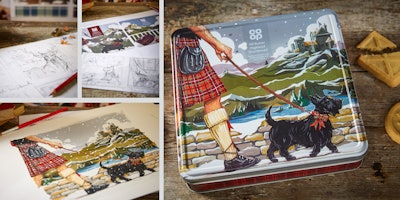
On Co-op’s core packaging, a snow pattern appeared on packs with and without photography. Ranges included Irresistible, Free From, and Party,with the snow pattern included on the latter two, while darker, more sumptuous photography was utilized to make Irresistible… well, irresistible. At POS, the graphics from the core range were teamed up with cuddly characters to make customers feel welcome. (Editor's Note: In May 2019, Equator received a Bronze Vertex Award for the design. The Vertex Awards recognize excellence among top creative professionals, with a focus on own-brand projects.)
The core products in ASDA’s private-brand offering displayed different background colors, depending on the product, however the panel and graphic stayed consistent. Its Extra Special, Party, and Free From ranges were given an extra dash of sparkle, while a classic Christmas font and snowflake motif could be seen at POS from signs to shelf stripping.
What didn’t work well? We won’t name any names here, but what did not seem to work was a disjointed approach that saw a lack of continuity from the package to the category branding on the shelf, as well as standalone POS photography that did not include information or brand messaging.
However, our audit yielded a positive generality about private-brand packaging: Own-brand holiday packaging is well established in the U.K., promoted by strong marketing in-store and on various media channels. There’s a strong diversity of holiday products here in the U.K., across many ranges and product types, from wine and party food to fresh items.
And thanks to healthy competition from many supermarkets on the private-brand front, the bar is being raised, demanding better packaging design year on year. With a wide array of high-quality packaging design represented in 2018, the challenge is already set for 2019.
Martin Orme is Creative Director and Dawn Wormald is Creative Director – Photography for Equator Design.