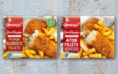
Frozen food brand Birds Eye U.K. has launched new packaging designs for its Simply Breaded and Harry Ramsden’s product ranges. Conceived and executed by brand design consultancy Brandon, the new designs mark a move away from the masterbrand strategy Birds Eye adopted over the past 10 years.
Tasked with reinvigorating the brand to help consumers find it more easily in supermarket freezers, Brandon created a design that heroes the product and evokes memories of happy times spent together as a family—around the family dining table and at the seaside, for the Simply Breaded range and Harry Ramsden’s, respectively.
As well as the nostalgic memories that are evoked through the food products themselves, the new brand packaging introduces the emotive image of Captain Birdseye to the range.
“At Birds Eye, helping our consumers has always been at the core of how we approach everything,” says Steve Chantry, Marketing Director, Birds Eye U.K. “Our products are designed to help serve up nutritious, delicious food every night of the week. Anything we can do to help the shopper identify the products they want with ease is a plus. Our new Simply Breaded and Harry Ramsden packaging designs, with extended color coding across the graphics and photography, does this through simplifying their shopping experience. We wanted to make sure that rather than just spotting the Captain, consumers could spot the particular product they are after. Brandon has been a fantastic partner from start to finish; they immediately understood our challenge and offered a solution that retains the nostalgia of our brand, which consumers know and love, while building each sub-brand’s individuality. We love the new designs and hope they will catch consumers’ eyes as much as they have ours.”
With the increased pressure from more sophisticated label branding in recent years, Birds Eye U.K. had to shift its design strategy. The existing color scheme of red for battered products and dark blue for breaded ones, combined with separate color coding for different fish species, have now been incorporated through the entire packaging design so that consumers can easily identify the products they are looking for in the freezers.
“This brief from Birds Eye is the kind of challenge we really enjoy getting stuck into,” says Richard Taylor, Managing Director at Brandon. “It wasn’t just the fact that we were able to work with such an iconic brand, but that we were able to help consumers, and drive a real change in the shopping experience. The simplification of the design was a really important factor in drawing the consumer back to this much beloved brand and making the overall buying experience easier and more convenient.”