New Tool: ProSource
Checkout our packaging and processing solutions finder, ProSource.

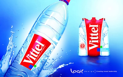
Vittel redesign stresses vitality

In the highly competitive market of Natural Mineral Waters, Vittel, the 150 year-old brand, needed to reinforce its positioning on the concept of vitality and emphasize those qualities on its brand and packaging design.

Redesign stresses vitality.


Vittel entrusted Logic Design, a French design agency, to create a new identity based on the theme of vitality. The new design is the perfect combination of the vision (consumer benefit), the charisma (graphic language), and the status (institutional dimension) of Vittel It expresses the vitality of the brand through a symbolic system of gushing water, with a key visual shaped by the V of Vittel and the vertical logo, which forms the brand block.

This powerful new brand identity  appears on the label and on the shrink film, providing Vittel with more of the dynamism and revitalizing energy that characterize the essence of the brand. The design allows Vittel to express both its promise and status and to assert the brand's power graphically.


Discover Our Content Hub
Access Packaging World's free educational content library!
Read More
Discover Our Content Hub
How AI is reshaping CPG manufacturing operations
Today’s CPG companies are faced with mounting challenges in their manufacturing operations. You have the data that could help you, but can you turn that data into knowledge? See how artificial intelligence can help. Learn what’s working for Pfizer, Post, and Smithfield.
Read More
How AI is reshaping CPG manufacturing operations