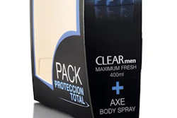
Misty forest is muse for men’s personal care line
Drawing inspiration from the dewy natural forests found on South Korea’s volcanic Jeju Island, Duffy & Partners has created a vista of strong, masculine package formats decorated with evocative treescapes for the new Innisfree Forest for Men personal care line. The Innisfree brand, launched in 2000 as South Korea’s first natural cosmetics brand, is sold exclusively in 200-plus Innisfree retail stores throughout the country. In the category of men’s personal care products, Forest for Men joins the company’s Moisture Effect line, introduced in 2010, and comprises premium skin and hair care products formulated “with Jeju phytoncide and green complex.”
According to Duffy team designer Katie Evans, for the new launch, Innisfree wanted an identity system that would reflect the simple beauty of its natural offering. “For the Forest for Men packaging, we were inspired by the earthy woodiness of nature and forests,” she says. “We strove to exemplify that through our inspiration for this project, which was the unadulterated natural forest of Jeju Island. We thought the best way to interpret the island was to design packaging that evoked a visceral feeling of nature when the product is used.”
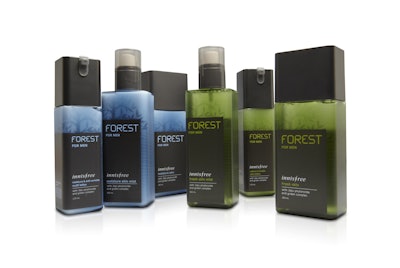
Appealing to the product’s male target audience, Duffy selected bottle designs with strong, square structures. Depending upon the product type—lotion, skin mist, cream, etc.—each bottle has its own distinct closure and/or dispenser type, but Evans says Duffy maintained a common thread for the Forest for Men line through the angular shape of each closure. Bottles were supplied by Hwa-In, with secondary cartons converted by Pacific Package.
For bottle decoration, Duffy chose colors, imagery, and typography that spoke to the natural elements for which the Innisfree brand stands. Bottle colors are muted neutrals of green and blue, with a block of black label covering three-quarters of the bottle’s front panel. Against the colored bottle background at the top of the package, printed on the translucent, matte film label, is the shadowy outline of “an entrancingly lush tree that feels mystical and soothing,” says Evans. Organically shaped type is used for the product name, placed prominently near the top of the black panel in a color that corresponds to the bottle (green or blue). Boxy, black closures top the plastic containers.
The Innisfree Forest for Men line was launched in May 2012, resulting in an increase in sales in the men’s product category of 300%.
Airy Alpine heights guide design for luxury skin care
Made in Switzerland and widely available in Hong Kong and Macau, the Zensation Beauté line of prestige skin-care products for women seeks through its name, packaging, and formulations to create a soothing experience that engages all the senses. Free of chemical preservatives, colorings, mineral oils, and animal ingredients, the line includes 25 SKUs, including serums, creams, gels, lotions, and toners for several skin types, and employs Swiss Alpine plant and fruit extracts as a primary ingredient.
“Zensation products are created to care for your skin, and also deliver a more fulfilling lifestyle,” says Zensation founder and president Anina Ho. “‘Zen’ represents calmness and purity, which is precisely what Zensation offers in its range of skincare. Simultaneously, Zensation also implies ‘sensation.’ Every product—from appearance and packaging to scent and touch—is created to bring out the most beautiful and natural feelings.”
Designed by Ho, packaging for the high-end products is light and airy, consisting of frosted glass containers with smooth, rounded shapes and white translucent closures, securely held in sturdy, bright white cartons that are minimally decorated. Illustrations on the cartons and on the glass packages were created by German freelance artist Karolin Klimek and depict pastel-colored Swiss edelweiss flowers and a white, snow-covered Alpine mountain range. Says Ho, “The original flower print symbolizes pureness, aroma, and the blossoms of Switzerland.”
The flowers are six color-printed in pale pink, blue, light purple, green, and black. On the front of the bottle under the mountain graphic, an area of unfrosted, clear glass allows flowers printed on the back of the bottle to show through.
Silver embossing is used for the Zensation logo on both the carton and bottle, for a sophisticated touch. In addition, sturdy carton inserts colored in complementary pastel colors add to the sense of luxury. “The stylish and elegant packaging reflects our customers’ status of a fulfilling lifestyle,” Ho ads.
In May, Zensation opened its first U.S. flagship store in Beverly Hills, CA, using the aesthetics of its packaging—in particular the flower design—as the touchstone for the store’s interior design. “The flower print is like decorative artwork,” says Ho. “It represents Zensation’s identity and philosophy, and fulfills our objective to enrich our customers’ sense of sight.”