Food packaging is the focus of the Shelf Impact!/Dragon Rouge survey of innovative package design for the second quarter of 2012. With composite scores ranging from 3.7 to 3.9 on a five-point scale, the leading innovations selected by survey respondents included Orville Redenbacher’s Popcorn Pop Up Bowl, Heinz’s new format for ketchup—the Dip & Squeeze—and Philadelphia Cream Cheese’s new bakery-pack packaging. Interestingly, all three scored exceptionally well in relation to conceptual idea, structure, graphics, and materials.
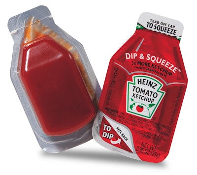
The highest overall composite score, as well as the highest scores in concept, structure, and graphics, goes to Heinz’s new format for ketchup, the Dip & Squeeze. The traditional ketchup packet has been around for 40 years, yet many consumers struggle to open it or skip it altogether to avoid the mess. As the name promises, the Dip & Squeeze allows ketchup to either be squeezed from one end, or the lid can be peeled back for dipping. Addressing unmet consumer needs, the Dip & Squeeze clearly differentiates the product in a commodity category.
Containing three times the amount of ketchup found in traditional packets, the red bottle-shaped package has a tear feature with a laser score at the top for easy opening and squeezing. It is convenient, easy to open, easy to use, less messy, and simple.
Convenience and ease of product use are also key points of differentiation for Philadelphia Cream Cheese’s new packaging in the South American marketplace. Based on prior success in the baked goods market, Kraft has incorporated an easy-open/reclose feature to the package. The ability to “reseal” the product improves convenience and freshness over the current flow-wrap package. The package also provides a superior value for product billboarding, with the metallized overwrap highlighting the bright color graphics and text. Finally, the product is still recognizable as the cream cheese in the foil within the box.
Following the theme of consumer convenience, Orville Redenbacher’s Popcorn Pop Up Bowl is a significant improvement over the traditional paper microwave popcorn package format. Traditional microwave popcorn bags have to be torn open on their sides, and often consumers burn their hands from the steam. ConAgra’s patent-pending design aims to solve these problems while also providing new usage occasions. The new product literally unfolds, pops, and then transforms itself into an actual bowl right inside the microwave. The result is a stable, wide-mouth bowl that can be shared and used on-the-go without spilling.
Design alone is not innovation
The packaging innovations that did not fare as well are not compelling enough either in terms of functionality or because their graphic treatment is either too busy or too cryptic to communicate to consumers what’s really new about them.
Pereg Gourmet Natural Foods recently launched its Quinoa-Rice-Couscous line, comprising “superfood” mixes that combine major health benefits with international flavors. The goal was to exceed the normal bounds of wholesome, flavorful, food production with packaging that appeared savory and tasty. To express the natural feel of the product, the designers opted for recycled, raw-type paperboard stock. While the pack design does visually communicate the natural qualities of the product, the pack is overly busy, and the real benefit is buried under too many claims. Besides, the concept of “bag-in-box” is not new and fails to captivate consumers in a new and interesting manner.
Marketed to diabetics and other health-conscious consumers, Meals to Live developed individual tabs for its line of frozen meals that are on the outer carton and printed with nutrition keys. Working with consumers and various health groups, Meals to Live learned that finding amounts of calories, sugars, etc., on printed packaging was often a time-consuming process. Support-group feedback suggested putting the vital nutritional information on the front of the carton so that aging eyes didn’t have to struggle to read such details. While the new packaging design for Meals to Live is interesting, respondents’ comments suggested the pack was feeling like a “me too” version of Lean Cuisine, and was lacking visual excitement to bring anything new to a saturated market.
Similarly lacking as it relates to concept and structure, Mina Harissa is a new, premium Moroccan red pepper sauce simply made with six natural ingredients (red bell pepper, red chili pepper, garlic, olive oil, vinegar, and salt). For a sauce that is hailed as the heart and soul of Moroccan cuisine, the intent and focus for the brand design was to express the culinary culture and authenticity of the brand. Playing with the motif of a red pepper, the brand icon mimics the interior of a red pepper and is meant to capture the essence of Mina Harissa through the use of the six ingredients within the shape of a bell pepper when cut in two. Its style reflects patterns and graphics found on traditional Moroccan tiles and textiles. While the explanation behind the design is interesting, the story is lost in translation. Respondents’ comments were unfavorable noting, “elegant logo design concept, unfortunately the general consumer wouldn't get it.”
One of the main lessons learned from this latest survey is that your packaging should not simply be approached as a wrapper or an eye-catching billboard. It can actually help solve a consumer need, whether it is adapting to different usage occasions, enhancing ease of use, or making the product interaction a little bit more fun. A packaging structure can go a long way to help reach these objectives. In addition, don’t make the mistake of assuming that a crafty label will explain what your brand is really all about.
Eric Zeitoun is president of Dragon Rouge USA, an international brand and design consultancy. Contact him at [email protected] or 212/367-8800.
The survey process
For the past four years, Shelf Impact! and Dragon Rouge have partnered in inviting readers to comment on current packaging innovation through a quarterly survey that probes value and level of innovation. For this survey, the second of four for 2012, participants were asked to evaluate 15 recent food product introductions through the lens of five distinct criteria:
1. The concept’s ability to provoke new ways of thinking about a category
2. The structure’s ability to present new ways of interacting with a product type
3. The packaging graphics’ innovative cues that help bring the product positioning to life
4. The use of innovative materials
5. The relative effectiveness of the packaging production process.
We look forward in the third quarter to reporting on our next series of high-performing packaging innovations, in the personal care and over-the-counter drug categories. If you have not done so already, please join the mailing list for Shelf Impact! to participate in this ongoing survey.