Redesign pays off

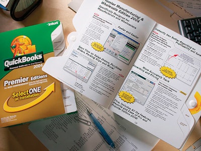
Intuit’s 2004 QuickBooks® financial software packaging recently received a facelift from design firm Libby Perszyk Kathman. The company increased the number of QuickBooks products from two to 15, giving LPK designers the challenge of taking recognizable brand traits and implementing them into the design, while also clearly communicating each product type and category.

Pw 13490 Quick Books1

“Simplifying our messaging and emphasizing our key equity elements is paramount because the QuickBooks brand is synonymous with fast and easy financial management software.

By understanding what information is important and what information is ancillary, we’re able to provide clear choices for our customer at the shelf,” says Tai Doong, group brand manager for QuickBooks Group central brand management. The cartons are offset printed in six colors with a UV coating. Cartons are decorated in the QuickBooks logotype—green and orange two-toned color—and “Qubie,” a metaphorical figure with a clock and bar graph that supports a consumer friendly architecture, designers say.

Need help with your packaging project?
We’ve done the legwork to identify and vet experienced packaging and processing consultants you can contact directly for your next project. Decades of combined experience in packaging line engineering, machinery selection, package and materials development, and food processing operations.
See your advisor options now.
Need help with your packaging project?
Is your packaging line built for connected packaging?
RFID, QR codes, and 2D barcodes are reshaping CPG operations. See how leading brands are adapting.
Read More
Is your packaging line built for connected packaging?