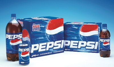
“Pepsi is about a youthful attitude, boldness, and excitement, and this look brings those qualities to life,” says Dawn Hudson, president of Pepsi-Cola North America. “Package graphics are the face of our brand and this more modern design embodies Pepsi’s youthful personality.” On Pepsi packages, including primary and secondary packaging, the word “Pepsi” is printed in a bolder, stylized font with a touch of silver for a more contemporary look and feel. Ice shards highlight the blue background to give it a dynamic, 3-D appearance. Designed by Landor Associates (New York, NY), the redesigned packages will appear in the United States and Canada in all major retail venues. Diet Pepsi, Pepsi Twist, Wild Cherry Pepsi, and Pepsi Blue will make slight adjustments in the future to mimic the new look. No product formulas will change.