In the hardware business, Elmer’s Wood Glue is number one in market share. Celebrating its 60th anniversary this year, Elmer’s Products, Inc., headquartered in Columbus, OH, decided that even Elmer could use a facelift. Says vice president of marketing Brian King, “We wanted to refresh our image, to convey a more contemporary look that goes along with the brand’s reliability.”
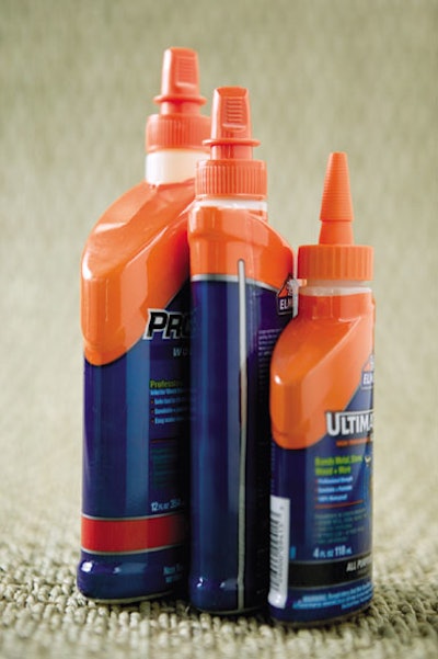
This led to repackaging of the entire hardware line, including a new bottle design for Elmer’s 40 SKUs of wood glue. The new bottle design features an oval shape that’s ergonomically comfortable to hold and use with one hand. It also features an offset neck with a push-pull cap and spout that’s over to one side for easy pouring into cracks and corners. The spout has two size openings for both thick and thin beading and also reduces clogging (the previous design necessitated cutting the top off of the cap).
As fate would have it, about the time Elmer’s had the new bottle design in hand last June, Troy Reed of Fort Dearborn Co. came calling. Fort Dearborn Co. is a leading provider of decorative labels for consumer product companies. And Troy Reed, a core account manager for the company says, “Within ten days of my presentation to Elmer’s about our wide range of print technologies and label formats, they called back inquiring about a shrink-sleeve label for their new wood glue bottles.”
Elmer’s King explains the decision to use a shrink-sleeve label this way. “We have four different bottle styles for our Wood Glue: 4 oz, 8 oz, 12 oz, and 16 oz. All together, there are 40 SKUs of wood glue in our hardware line. We had been using a pressure-sensitive label for the old bottle, which was limited. What appealed about the shrink sleeve is that it wraps 100% around the whole bottle. This allows for more product information, and more consistent information to be displayed across the product line. Now we can tell a story on the label detailing important benefits of the different types of wood glue (stainable, waterproof, ultimate, etc.). In essence, there’s sufficient space to tell consumers how to upgrade and get exactly the right glue adhesive they need. There’s space to communicate. Besides, the shrink-sleeve label looks fantastic. It is glossy and has shelf impact now that the entire product is covered.”
At Fort Dearborn, the project was tackled by technical manager Charles Al-Bazi. As impressive as the new bottle looks, it did have its challenges due to the slope of the neck and its hips. The shrink distortions were considerable. Says Albazi, “There is high shrinkage to one side. With the offset neck, the opening does not shrink as much as the sloped shoulder side. What’s more, the larger 16-oz size is more difficult on distortion because of more distribution. There is 67 to 70 percent shrinkage required depending on bottle size.”
PETG as a solution
With this sort of challenge, Fort Dearborn turned to its principal supplier of PETG shrink-label films, Klöckner Pentaplast, which responded with a high-shrink Pentalabel® film that works on all four sleeve sizes.
“We had to play with where the location of the seam would fall on the bottle and the direction of the art design as the bottle goes through the shrink tunnel,” says Tim Nicholson, vice president of marketing and technical services at Fort Dearborn. “And we ended up putting the seam on the back right.
“Not only did Fort Dearborn produce the shrink label, they also helped Elmer’s identify an interim packager, Verst Group, that could hand apply the shrink-sleeve label while Elmer’s regular contract packager retooled its machinery to automate the process. This identification process involved several trips to the interim supplier with Elmer’s Arden Haynes, senior packaging engineer, and other staff in order to set up the shrink tunnel for the best, most consistent shrink. “Verst gave us valuable input on adjusting the tunnel, including steam outlet pressure exhaust and the conveyer,” says Nicholson.
Elmer’s Haynes was also involved on the cut length of the sleeve. Though for the most part the new bottle is the same width as the old bottle, it’s taller and requires more shelf headroom. This dictated the height of the label and again demanded getting the best shrink possible. Haynes is pleased with the results. “The film performs to our expectations,” says Haynes. “There is high shrink at the top of the bottle, yet it looks great. This was a challenge because of the bottle’s side wall angles going into the shoulder of the bottle. In addition, the taper from top to bottom presented shrink issues having to do with getting a good lock on the shrink sleeve. By the same token, because the opening is off-center, the sleeve does not come up as high as it might. So yes, the high shrink top took some adjusting.”
The graphic details
Another member of the team was the Toronto agency that created the production art for the bottles. Fort Dearborn also worked closely with them for proper placement of shrink-label graphics to avoid distortions such as wavy lines around Elmer’s “house.” “Though you wouldn’t notice if you were looking at the logo, it also changed some,” states Elmer’s Brian King, “For one, the bull’s head is a little larger. We have to walk the line with a bull that appeals to school children as well as hard-core construction guys.”
In fact, graphics requirements included four or five designs for each of the four bottle sizes, and even then, a particular size might have a few different vignettes (of print copy) for the same product. This meant the label might be either a 9- or 10-color flexographic press job. UV flexo is stronger with finer dots, so printing the vignettes was more consistent using this method rather than water-based inks. Fort Dearborn modified a piece of equipment to achieve this. The process with Pentalabel® involves printing the film, slitting it into lanes, seaming it into a tube shape, and cutting individual bands (cut band) sleeves. Fort Dearborn has since initiated shipping the sleeves as roll-stock.
Tim Nicholson at Fort Dearborn says this about the graphics. “We chose to use our UV flexo printing process in order to highlight Elmer’s vibrancy, especially the company’s signature core orange.” Over at Elmer’s, Brian King concurs. “PMS 165 orange is how consumers identify us, as well as the blue,” says King. “That’s why we put a lot more orange on the label as well as making the cap bright orange. With the bottle’s new design, consumers just have to look for the orange cap to recognize Elmer’s.”
Elmer steals the show
Elmer’s hardware line was the center of attention at the recent National Hardware Show with a 20 x 40 foot banner that proclaimed ‘Rebuilt for Results.’
“There was a lot of interest and unsolicitd [complimentary] comments at the show,” says King. “The bottle was the hero. Those new bottles were impossible to ignore. They just look so good.” He goes on to explain that Elmer’s strategy is to get retailers excited about the new wood glue bottle design and get it on the shelf to create attention. Once having retailer’s support, then Elmer’s will start talking to the consumer directly, such as the DIYers, moms, and independent contractors. Near the end of the year, the company also plans to run a series of trade ads to individual buyers as well as hardware retailers.
The first new bottles hit the market of a major retailer at the end of February, with other significant retailers such as Lowes receiving the new wood glue bottles close to May in time for the Memorial Day spike in sales—and just before the National Hardware Show. Concludes Arden Haynes, “The new bottle goes right to consumer benefits, with a shrink-sleeve label that helps them decide which product is best for them. It stands out on the shelf, and our customers are responding. There is a lot of excitement and interest around the new bottle.”
His colleague Brian King has the last word when he says that the new bottle costs roughly the same to produce, and the notice it’s generating is definitely worth it. “Some of our retailers were interested in doing special off-shelf promotions toward the middle to end of 2007, so the newly designed bottle with its glossy shrink label was definitely generating the kind of attention we want, says King. “Fort Dearborn had the technical knowledge and perspective to make it all come together.” —Pat Reynolds