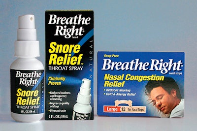
The company needed the package to clearly communicate its use and benefit, be easily identifiable as being made by Breathe Right, and carry a strong visual presence on store shelves. Designers at Mackey Szar (Minneapolis, MN) placed an image of the spray nozzle and pump on the secondary packaging to properly show consumers how the product could be used. They also placed the name of the product in large, bold letters in front of a background that further communicates function. Designers also used spots of sapphire blue on front and side panels because it is widely considered a “calming color.”
Companies in this article