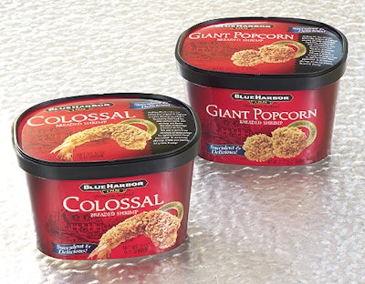
Designers chose the tapered wall container, which resembles an ice cream tub. Because Azure Waves is a small company entering a market dominated by well-established competitors, strong brand identity and packaging strategy is important to assure Azure Waves gain recognition on the shelves. The tapered wall tub, not often seen in the seafood category, and powerful hot red and black graphics, offer strong visual impact at the point-of-sale. To further emphasize the quality associated with fresh seafood, the brand name Blue Harbor Inn was designed to replicate authentic imagery of the Gulf Coast region. The product is prominently shown on the front, rear, and top panels of the tub and is supported by background graphics of the Blue Harbor Inn. The 18-point SBS tub is litho printed in four colors plus two line colors and varnish. —ALR