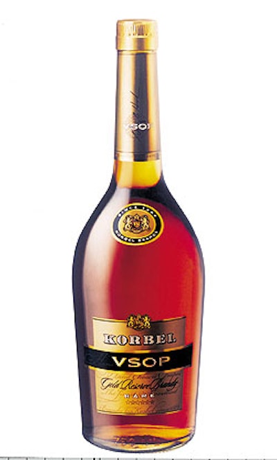
The elegant appearance of Korbel’s VSOP label is the result of skillful design and converting expertise. “The combination of gold inks, gold bronzing, and gold hot stamping gives a rich appearance that’s appropriate for this product,” says Fred McDaniel of HKA, the design firm that worked with Aaron Heck on all three labels. “It adds a visual dimension that makes the label look very upscale.” The bronzing step is a bit unusual in label converting, though Gary Valentine of FP Label says that it’s not uncommon in high-end beverage labels. It’s done in a separate machine that hooks up to the company’s offset press. “First, we apply an ultraviolet-curable clear adhesive with a plate blanket that allows the adhesive to be applied in any pattern,” Valentine explains. Then the gold-colored “dust” is sprinkled onto the adhesive pattern and the excess is vacuumed off. The powder that adheres to the adhesive is then cured with a UV lamp. Finally, a clear press varnish is applied over it to seal it and keep it from being abraded. “Bronzing gives it a unique look that’s really different from that of a gold ink,” he adds. “It gives a textured appearance that’s not possible with inks or hot stamping.”
See the story that goes with this sidebar: New products, new looks for Korbel brandies