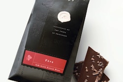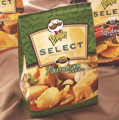
Say the word "Pringles," and the image of a saddle-shape chip in a cylindrical container comes to mind. But when LPK (www.lpk.com), the design agency for Procter & Gamble's Pringles' brand, came up with a design for the company's new Pringles Select gourmet potato chips, the firm dropped the cylindrical can in favor of a block bottom pouch.
According to John Recker, LPK's executive vice president and chief strategy officer, the switch from a traditional, rigid form to a more organic, high-quality package with a sheen to it is in keeping with consumer expectations of gourmet products.
To further strengthen the brand communication, the Select name is set in a shield containing an image from a destination that helps to tell the story of the different Select flavors, thereby enhancing the customer's emotional connection with the product. "Gourmet snacks are a new area for Pringles," says Recker. "The photography is of fresh and natural ingredients, appealing to consumers that have an elevated expectation of indulgence and taste."
The foil-laminated bag material is gravure-printed in seven colors by Sonoco Flexible Packaging (www.sonoco.com).
Available in 5.5- and 8-oz bags, Pringles Select comes in four flavors: Cinnamon Sweet Potato, Parmesan Garlic, Sun Dried Tomato, and Szechuan Barbecue. Each flavor is distinguished by a different color: "We leveraged the idea that shoppers often shop by color," says Recker. "This is an impulse category, so you need to leverage design as a navigation tool so shoppers can find their particular product and/or flavor very quickly."