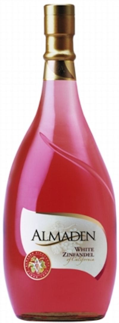
“We had repackaged our boxed wines last spring, and we really tried to make the bottle labels look more like a family,” says Pawlik. “Now, when the bottles and boxes are side-by-side, the appearance helps communicate to the consumer that, whether in a bottle or a box, they’re getting the same quality wine.”
The new label graphics were designed by HKA Design. “Our refinement of the Almaden wordmark was inspired in part by the custom Almaden 1.5-liter bottle and its flowing lines that have proven so successful with consumers,” says Ken Horiszny, a principal with the design firm.
The labels are 2-mil clear biaxially oriented polypropylene that Collotype prints with a combination process of rotary screen, offset and foil stamping. “In terms of colors, let’s just say ‘many,’” says David Buse of Collotype. The hot stamp color of gold, bronze, or silver corresponds to the color of the capsule and neck labels.
“Although the label doesn’t appear clear because of the heavy ink coverage, the seal at the lower left is largely clear to show the color of the wine through it,” says Almaden’s Pawlik. “We think the seal is an important icon or cue for consumers. We’ve always had a seal, but it’s been more stylized in these versions.”
The label design will also be adopted for Almaden’s 3- and 4-L glass bottle sizes, as existing inventory is exhausted.