Last year, the Ferraro Group was looking for a way to engage Mexican millennials with its 50-year-old Tic Tac brand of mint candy through a seasonal package that would reflect its unique style. After considering several options, such as Halloween and Christmas, the Tic Tac team chose the Mexican Day of the Dead as the perfect holiday to inspire their packaging. With the holiday chosen, the team turned to design firm 121, which began working on an exclusive concept for the brand’s new package design.
The Day of the Dead is a treasured holiday for the Mexican people. It takes place every Nov. 2 and has its origins in pre-Hispanic tradition. The holiday is a celebration that honors deceased family members and friends. Mexicans believe the souls of their loved ones return to this world to visit their living relatives on that day. That’s why people set altars filled with food, flowers, sweets, and other offerings. Additionally, they also place a picture and a few personal effects of the dearly departed.
Because the design had to appeal to young adults and millennials, it couldn’t be scary or spooky, even though the holiday is related to death, says 121. On the contrary, it had to reflect all the joy and colors that surround the festivity. The design aimed to embody what Mexican culture is all about: tradition, vitality, happiness, and fun.
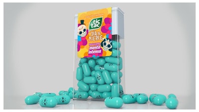
With this complex concept in mind, 121 developed a design proposal with a vector illustration technique that reflected the spirit of this Mexican holiday. The label incorporated some of the most important traditional elements of the Day of the Dead. The marigold flowers that guide the souls of the deceased back home were present in the vibrant yellow background of the package. A subtle texture that mimicked the shape of the petals gave the finishing touches to the base of the label.
Furthermore, the design also featured two sugar skulls: a male and a female. These elements were a reference to the traditional sweets that appear on the altars. But not just that, they also represented the figures of La Catrina and El Catrin, two skeletons that have become a symbol of the Day of the Dead.
The design concept was so powerful that it was taken a step further, explains 121. Not only did the label take inspiration from the Day of the Dead, but the actual mints were decorated with a skull print as well.
Overall, says 121, the packaging turned out to be a bold, colorful, and lively design that embodied the Day of the Dead. The product was released in the Mexican market in October 2018, just in time for the annual celebration.