Who said you shouldn’t play with your food? Certainly not Kraft Heinz. With its new Jell-O gelatin dessert line, introduced in mid-2018, the company is encouraging families to do just that.
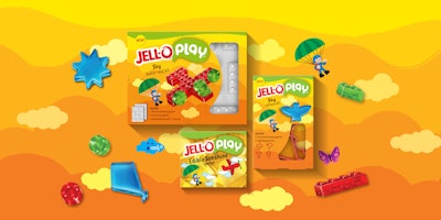
Jell-O Play is a line of gelatin products packaged with molds and cookie cutters that transform the dessert into Lego-like blocks, castles, and animals. Called Build + Eat Blocks and Build + Eat Cutter kits, the line includes six varieties, each of which also contains edible stickers for kids and parents to customize their creations. The new products were designed, Kraft Heinz says, to bring families together in the kitchen for creativity and fun.
“Jell-O is a well-established, family-favorite brand, and we wanted to widen its appeal to a new generation of time-starved millennials and their kids,” says Katy Marshall, Marketing and Sales Lead of Springboard, a new Kraft Heinz platform. “Today’s working parents have limited time available for playing, cooking, and eating with their children. Jell-O Play enables them to combine all those activities in a single experience.”
Straddling both the food and toy markets, Jell-O Play presented a complex packaging design challenge. For this, Kraft Heinz turned to global packaging design firm Equator Design in January 2017 to create packaging that would draw on both the traditions of the brand as well as familiar packaging from the toy aisle to create something new and different.
Development of the Jell-O Play concept was supported by research into a wide array of toy brands as well as food-based family brands. “The primary learning was what sort of communications, visually and through language, that go into these brands,” explains Alysha Balog, Senior Designer at Equator. “Toys utilize lots of color and imagination and prioritize the visual of the toy, whereas the grocery aisle utilizes appetite appeal and strong brand blocking. However, Jell-O Play needed to function in both, so we had to bring in the colorful world of the toy aisle and balance it with the flavor communication of the grocery aisle.”
The resulting design articulates the brand’s no-rules approach to play on-pack and brings to life the fun and wide-reaching opportunities for play, including construction, storytelling, and creative imagination. Graphics include the Jell-O Play logo; eye-popping primary-color backgrounds that reflect the product theme and communicate “new” to the consumer; playful, cartoon-like characters that support different themes, such as construction, safari, sky, and ocean; copy on the flavor variant; information on what’s in the package, including depictions of the mold and cutter shapes; and examples of the gelatin creations possible with the products.
Die-cuts in the carton allow the consumer to see the cutters or molds inside. Says Balog, “Our research into both the toy aisle and grocery aisle revealed that cut-outs served two purposes: In the toy aisle, it prioritizes the communication of the toy in a chaotic and colorful aisle, and in the grocery aisle, it was used to show components, most commonly utilized to separate products as a kit rather than a grocery staple. And, since Jell-O as a brand has a history of occasionally using windows in some of their limited-edition products, it was the perfect tool to position Jell-O Play into both the toy and grocery aisle.”
Equator retained Jell-O brand’s preferred carton format and color scheme to establish not only a cohesive look and feel across the full product portfolio, but also to strategically color-block the shelf set in the aisle. Each pack is decorated on top with a signature-green masthead to help differentiate pack sizes and colorways for intuitive brand recognition and shoppability. Cartons are offset-printed in four-color process plus two spot colors by Graphic Packaging International.
When introduced, the product line met with tremendous excitement from consumers and the media, receiving more than 500 million impressions with hundreds of placements across TV, print, and digital.
Says Kraft Heinz’s Marshall, “While we provided a very detailed brief for the Jell-O Play project, we also trusted Equator Design’s interdisciplinary team with the creative freedom to fully explore the brief, which has resulted in a cohesive, sophisticated, eye-catching, and scalable packaging range.”
Jell-O Play products are available nationally in major retailers, including Walmart, Kroger, Target, and Amazon.
