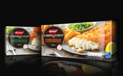
Birds Eye is disrupting the frozen fish sector in the U.K. with a new identity and packaging for its premium Inspirations range created by creative agency Brandon.
Brandon’s design uses mouth-watering images of food on the front of pack, inspired by the editorial style of food photography currently seen in food and lifestyle publications.
Brandon’s work moves away from the rest of the frozen fish category, strengthens the brand, and creates an iconic logotype icon reminiscent of restaurant signage to communicate the premium quality of the product.
Colorful lifestyle images of fresh food dominate the front of pack and highlight the premium nature of the Inspirations range, helping it stand out from its competitors, where the prevailing packaging is often too black and difficult to see through a frosty freezer cabinet window.
The team took the bold step of making the Inspirations logo more prominent than the Birds Eye logo, to encourage sub-brand recognition. The new logotype icon elevates the brand from the core product range, communicating the everyday luxury that Inspirations brings to the table.
Says Steve Conchie, Creative Director of Brandon,“Packaging design within the premium frozen fish category was all beginning to look like wallpaper, with every brand opting for full-on black packaging to create a premium feel. As a result, no one brand was standing out.
“The bright editorial-style food photography taken from the fresh ready meals sector gives Inspirations cut through. Our design makes it simpler to both decode the premium nature of the product with plenty of quality craft cues, but also for shoppers to find what they are looking for at speed, by promoting the product benefits for each of the various ranges within Inspirations.
“Our creative concept was to show people that Inspirations would provide a dining out experience at home, but without the hassle of a long, drawn-out cooking process for something that little bit different to the norm.”
Says Andrew Elder, General Marketing Manager, Birds Eye, “The new identity and packaging design helps our range stand out from the competition and effectively communicates its premium qualities. Consumers love going out for dinner, but the work by Brandon shows them they can have that bistro experience at home, without the expense of eating out or cooking in the kitchen all evening.”
The new identity and packaging design is being rolled out now, with the first two SKUs, Chunky Cod Fillet in Golden Batter and Basa Fillets in Sea Salt and Malt Vinegar, launched in October 2017.