Founded in 2013, ebbu LLC is a disruptive cannabis research, development, and distribution start-up launched with the goal of making cannabis predictable, consistent, and reliable so that everyone who is legally able to can enjoy it. Ebbu’s products consist primarily of cannabis concentrates produced through an extraction and purification process done at its state-of-the-art plant in Evergreen, CO.
Through research and development by its team of five PhD scientists, ebbu recently developed technology to tailor its cannabis products to produce specific effects: relaxation, energy, focus, etc. In preparation for the rollout in August 2016 of two new products based on this innovation and the phasing out of its non-differentiated concentrates, ebbu looked to brand strategy and design firm Trinity Brand Group to create a new visual identity for the brand.
According to ebbu Vice President of Marketing Kedric George, ebbu’s products are completely unique, and its packaging needed to be as well—moving the brand from a commodity to a premium lifestyle brand, conveying both function and emotion, and making it easy for consumers to shop the line.
“Cannabis is quickly becoming a legitimate consumer packaged goods product, and the packaging and consumer experience should convey this idea,” says George. “At ebbu, we know our products are unlike anything else on the market. We wanted our packaging to reflect that, as well as resonate with the current consumer and the upcoming, more mainstream consumer.”
Predictable, consistent experience
As the fastest-growing industry in the U.S., the legalized marijuana market is worth $2.5 billion today and is expected to grow to $11 billion by 2019. Competition is fierce, and the range of products can be overwhelming for consumers.
“Right now, much of what’s out there is unpredictable,” says George. “The naming conventions don’t allow you to have any clue as to what you should expect. The strains may vary from grower to grower and store to store, and therefore, so can the plant’s effect on the user.”
When CEO Jon Cooper co-founded ebbu, he believed that more people would be open to trying cannabis if they could be assured of a safe product that provided a predictable experience. Ebbu’s new technology allows for a specific physical reaction or feeling that is consistent and reliable, time after time, no matter where the consumer buys the product, or when or where they use it.
In layman’s terms, the process involves extracting the various components of the cannabis plant—cannabinoids, terpenes, and others—and combining them in different ways that cause them to react with the body’s receptors to produce certain responses, referred to as the Entourage Effect.
Ebbu’s new products include Bold, formulated for regular users who are looking for potency, and Well, a product designed for the holistic medical practitioner who believes in the healing power and restorative and regenerative properties of cannabis. What will become its flagship line, Feelings, is still in development. Feelings will include five varieties—Chill, Bliss, Create, Energy, and Zen—that will allow the consumer to choose how they feel.
Balancing tension points
Trinity’s work with ebbu began in April 2016, just five months before the scheduled launch of the new line. According to George, in addition to completing the design work in a very condensed timeline, ebbu also tasked Trinity with building a strong, consistent, and differentiated master brand that could extend across all touchpoints and set a foundation for future expansion. It was also looking for a premium appearance and feel for the core product line that would hold together as a system, while creating clear differentiation across products.
Another requirement: Ebbu wanted a visual identity system that not only delivered the functional information about the product, but also evoked the appropriate emotional response related to the product form. The packaging also needed to make the product line easy to navigate, shoppable, and inviting.
According to Trinity CEO and Executive Director of Strategy & Client Services Matthew Youngblood, Trinity’s strategy for the project was to first uncover tension points in the industry—for example, science versus nature, function versus benefit, and friend versus expert. “By identifying these points of tension, we could have a conversation around how to address them as we developed and clarified the brand’s focus and meaning,” he says. “Since ebbu’s objective is to appeal not only to core cannabis users, but also to new mainstream and casual dabblers, we needed to be sure we were looking at both cultures and finding ebbu’s unique positioning.”
Trinity’s strategizing also included an audit of competitive brands. Its research uncovered two categories: those that were about traditional pot culture, relying heavily on the use of marijuana leaf visuals, and those that looked more cold and engineered, emphasizing the science and function of the product. Overall, Trinity found the branding of most marijuana products to be very dark and clichéd—“a concert t-shirt mentality,” according to Youngblood.
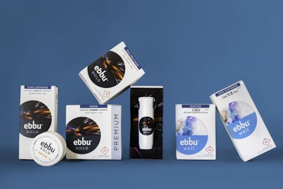
Putting aside these clichés for ebbu’s visual branding, Trinity looked outside the category at highly emotive and premium lifestyle brands. Instead of black, secondary cartons for ebbu’s new product lines are a clean white, decorated with an offset circular graphic meant to represent the lens to the world that ebbu opens up for the consumer. For each product, a different street-art-inspired illustration by artist Sean Coleman of Brave World Marketing is positioned within the “lens” to represent the feeling produced by the product. In some cases, the artwork is continued on other panels or inside the carton.
Trinity designed a new logo for ebbu that uses all lowercase lettering, with the letters ascending upward, suggesting elevation, growth, and a journey skyward. For the masterbrand color, Trinity chose a rich blue, selected to radiate trust as well as a natural feel. All Packaging converts the cartons, which are printed in seven colors plus soft-touch and gloss varnishes that lend a premium appearance and feel.
In addition to aesthetic considerations, the packaging also needed to provide space for regulatory labeling. Currently this includes “warnings of use,” as required by the Colorado Marijuana Enforcement Division (MED), as well as universal THC symbols and warning copy for recreational and medical products. The back of each carton is blank, providing space for labels that can be updated as regulations evolve.
Structure aids budtenders
Structurally, the new packaging for ebbu serves several purposes. Ebbu’s new product formats include concentrated cannabis for vaporizer (vape) pens and for “dabbing” or mixing into drinks, packaged in a cartridge and a dram vial, respectively. Both primary packages are child-resistant and opaque, per industry compliance regulations. These containers are then packaged in the secondary cartons, which can be easily opened and reclosed in the dispensary.
Ebbu’s previous packaging, described by George as “wholly undifferentiated” in terms of graphics, used a card wrapped around the package tied by a ribbon to set the products apart from others on the shelf. However, in a marijuana dispensary, only the “budtender”—the dispensary worker who recommends and sells the products—has access to the shelves. When a consumer wants to see what’s inside a package, the budtender takes it off the shelf and opens it up for viewing. With ebbu’s former design, budtenders rarely reassembled the package.
“When we went on our store audit, we found that the package was never put back together,” says Youngblood. “The packaging was not only visually black and undifferentiated, but all the little tricks ebbu had included to make it different were never utilized because the budtender wouldn’t tie it back up.”
To meet and take full advantage of the consumer’s desire to touch and manipulate cannabis product packaging, Trinity designed the cartons either as a sleeve with a slide-out box that holds the primary package or a flip-up side and top panel. As consumers open the box, they are met with an interior decorated with a burst of color and the brand artwork in its entirety. After viewing the product, consumers can reclose the carton, “without doing any damage to the first moment of truth and how it appears at shelf,” explains George.
Trinity also designed the square and rectangular cartons to provide maximum impact on shelf while also being compact enough that they don’t take up too much space in small retail footprints or in backroom security storage (all product is taken off the shelf and stored at the end of each sales day). The cartons are also easy to stack and nest on-shelf and in storage.
George shares that ebbu has learned from its experience in dispensaries that products that are easy to open and close, easy to display, and easy to store are the ones budtenders are inclined to recommend more often to consumers.
A classic approach in a fledgling market
Ebbu’s new product is all about allowing the consumer to choose their experience with cannabis, a concept that inspired the tagline from Trinity, “It’s Your Journey.” Breaking away from the traditional marijuana stereotypes, packaging for the products likewise hones in on that experience, with graphics that reflect the feelings associated with each product.
But the truly unique aspect of the project, according to Youngblood, is ebbu’s approach to its branding. “Legalized marijuana is an emerging market that is really akin to the Wild West, where a lot of the manufacturers don’t have classic brand marketing backgrounds,” he says. “Ebbu approached its branding with a really rigorous audit process and creative positioning strategy, similar to a classic CPG project. This resulted in a creative packaging program with a master brand that then carries across a lot of different product lines. So not only is the lifestyle brand and product unique, but also the process in which the branding was done and the kind of team that put it together is pretty unique, too.”
Adds George, “Ultimately we are building a platform and foundation that will allow us to be steps ahead of our competition to scale with markets as they open to effectively bring cannabis to the mainstream.”