Design inspiration can come from the most unexpected places. When June Jacobs, founder of high-end skin care company June Jacobs Spa Collection, and her design team pulled out some of her old family photo albums for inspiration for new package graphics, it was the intricate pattern on the front of one of the antique albums that captured their attention, rather than the photos themselves. Interwoven with fruits, berries, and leaves, the pattern resonated so strongly with the brand’s heritage, it became the model for a delicate filigree design used on all of the company’s packaging.
A 30-year spa and beauty industry veteran, June Jacobs introduced the June Jacobs Spa Collection in 2003 as a botanically based alternative to the luxury skin care products available at the time. To formulate her products, June Jacobs drew from the rituals she had witnessed growing up of the women in her family using antioxidant-rich ingredients for healing and beauty remedies.
Products in the June Jacobs Spa Collection are now sold in more than 40 countries in resorts and spas, online, and at select specialty retailers. In 2013, the company launched an in-room hotel amenities program with Hyatt Corp. The following year, to help consumers who had tried the collection at spas and hotels more easily shop their products at retail, June Jacobs decided to expand its distribution as well as redesign its packaging.
While graphic design was key for the new package, finding a partner to manufacture a carton with the same high quality as its original packaging as well as meticulously execute the graphic design was equally as important. June Jacobs found a partner to achieve its vision with packaging solutions provider JohnsByrne.
Design vision is ‘a tall order’
The June Jacobs Spa Collection includes 12 product families, each formulated to provide specific benefits. Products include cleansers, scrubs, toners, moisturizers, and serums, among others. Every product contains a 20-year, U.S.-patented antioxidant blend of white, red, and green tea extracts combined with goji berry, pomegranate, and grape seed extracts to combat the visible signs of aging. A high-end brand, June Jacobs Spa Collection products are priced anywhere from $10 up to $140.
The June Jacobs amenities program includes a range of shampoos, conditioners, lotions, soaps, and mouthwash. “Our in-room hotel amenities are in over 30,000 rooms and are reaching millions of consumers each year,” says Managing Director Rochelle Jacobs.
The problem in 2014, however, was that these hotel-guests-turned-fans could not easily find June Jacobs products, prompting the company to expand distribution. “In order to make the June Jacobs Spa Collection a success at retail globally, we took the next step and updated our packaging,” Rochelle Jacobs explains.
The redesign was a collaboration with brand strategist Brand Growth Management and design firm PowerShovel. Says Rochelle Jacobs, the design brief was a tall order: “It had to be aligned with our mission and vision, accentuate our heritage, and have an original design that was colorful, elegant, and youthful, all while reaffirming our brand as a pioneer in the skin care industry.”
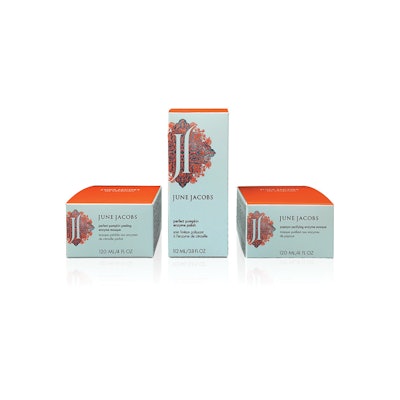
The final design, encompassing 52 SKUs, is simple but elegant, using the photo album-inspired graphic as the central element. The graphic comprises a Mediterranean-like solid-colored symbol (referred to by June Jacobs as a cartouche) overlaid with a filigree pattern and two “Js,” one right side up, one upside down.
“Within our new design, if you look closely, you can find fruits such as pomegranates—one of the fruits used in our antioxidant blend—incorporated subliminally,” says Rochelle Jacobs. “This kind of element was important to us as we were looking to find a design that had a personal touch. The design itself is inspired by and rooted in the skin care rituals practiced by women in our family.”
The 12 lines in the collection are now color-coded, with soft, calming colors, such as pink, gold, light green, and light blue, to distinguish each line’s benefits and make them easy to shop.
A challenging packaging job
The choice of JohnsByrne as the carton producer was pure serendipity. JohnsByrne had sent out a direct mail piece on its finishing techniques called, “The Things We Do for Beauty,” which landed on June Jacob’s desk. Says Rochelle Jacobs, “She was immediately impressed and insisted on meeting JohnsByrne for our package redesign.”
One of June Jacobs’ requirements for the carton was that it had the same durability and overall luxurious quality in terms of color richness and tactile feel as its previous packaging. In addition, explains Michael DiFranco, Vice President of Marketing for JohnsByrne, “they wanted each franchise [product family] design to have its own unique color, excellent-contrast coatings, and perfect print-to-embossing register, all to yield exceptional-looking packaging that would represent their brand identity with pride.”
JohnsByrne approached the project by listening to the designers’ needs and matching them with its print and finishing capabilities in order to maximize the carton graphics, enhancing each design element. “Specifically, the June Jacobs’ cartouche is a very finely detailed design that the client wanted embossed and registered tightly to the print. The client wasn’t sure if we would be able to do this, given how challenging the requirement, but we pleasantly surprised them with successful execution.”
JohnsByrne’s solution was the use of its one-of-a-kind concept printing press from Heidelberg that was designed and configured specifically for them. Named Press384 by JohnsByrne, the press has three coating units, eight printing units, and four drying units. The press has a maximum-rated speed of 18,000 sheets/hr, is 130-ft long, and has an automated sheet-feeder logistics system that supplies nonstop, computer-controlled sheet feeding for increased productivity. According to DiFranco, this all translates into reduced make-ready times and increases overall output.
“It also allows for more creative freedom, as brand owners such as June Jacobs Spa Collection can achieve greater visual and tactile effects with multiple coatings, varnishes, and ink combinations in one pass,” he adds.
Redesign opens new doors
The challenge of the June Jacobs carton project was to perfectly reproduce PMS colors combined with high-contrast spot coatings while at the same time achieving exact register of all graphic and embossing elements. Preparation for the project, DiFranco says, involved planning and pre-production testing.
Each product family uses five distinct PMS colors plus gloss and dull coatings, with embossing and debossing treatments. “JohnsByrne took the delicate filigree pattern, and by using spot coatings and maintaining highly critical embossing register, it allowed the packaging to have a pristine look,” says Rochelle Jacobs. “The subtle shading of PMS colors in the cartouche shape gives a unique identity to each of the collections.”
The carton—sized to accommodate products from a 0.5-oz lip balm to a 6.7-oz body balm—is made from .024 SBS stock and is embossed, die-cut, and glued on a Bobst finishing machine.
The new packaging was introduced in April 2015 in the U.S. to select online retailers, such as bglowing.com. In fall 2015, June Jacobs expanded its distribution throughout Asia, with a retail agreement with Sephora, which now carries June Jacobs Spa Collection products in 200 of its stores in five Asian markets.
Rochelle Jacobs says the company has received “overwhelmingly positive” feedback on the new packaging: “The enthusiasm, especially from our existing clients, has been beyond our expectations, and we have picked up significant new strategic partnerships along the way.”
Adds Difranco, “This was an amazing collaboration with June Jacobs, and we were both extremely delighted that the new packaging won the Paperboard Packaging Council’s General Excellence Award in 2015.”