Launched in 2009 by Boulder, CO, mom and entrepreneur Nova Covington and her husband, scientist Paul Halter, the Goddess Garden Organics line of sheer, mineral-based sunscreens for children and adults provides safe and powerful skin protection, without the use of synthetic chemicals. Appealing to consumers looking for an alternative to chemical-based sunscreens, the brand soon developed a loyal consumer following. But in 2014, Goddess Garden recognized that most consumers were not familiar with the company’s brand name.
“Our packaging was a little kitschy, but it was very memorable,” says Covington. “Unfortunately, the name of our company was buried. People who knew our products could find us on shelf, but we ended up having brand recognition challenges because they couldn’t remember the name of our company.”
Hearing of the success of their neighbor, New Belgium Brewing, in redesigning their beer packaging to address this very issue, Goddess Garden contacted New Belgium’s designer, Hatch Design, to simplify their packaging graphics to emphasize the brand and its benefits.
Cluttered label leads to confusion
As necessity is the mother of invention, the catalyst for the development of the Goddess Garden line was Covington’s need to find non-allergenic skincare products for her daughter, who was sensitive to virtually all synthetic chemicals. “I started looking at products and realizing there are a lot of unknown ingredients,” she says. “That was kind of the big ‘wow’ factor. There were some natural sunscreens available, but they weren’t usable—they were really whitening.”
As she explains, chemical and mineral sunscreens work very differently. Whereas chemical products are absorbed into the skin and go right into the bloodstream, mineral sunscreens sit on top of the skin. Mineral sunscreens are also biodegradable, “washing off and settling right back into the earth,” she says. “Chemical sunscreens wash off and go into our water supply. The molecules are so tiny, they can’t be processed out of the water supply through water treatment plants, so they end up in our ocean, creating a lot of damage to coral reefs.”
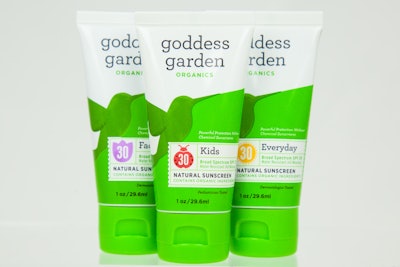
With Goddess Garden’s original packaging, many of these benefits were called out on the packaging, but in such a way that it resulted in a jumble of information and graphics. “It was nice and bright on the shelf, but it ended up being cluttered, and the essence of the brand was lost,” says Covington. Consumers familiar with the products tended to shop them by graphic elements such as the green swoosh at the top and bottom of the package, and the ladybug icon (on the kids’ version).
In addition to making the brand name more prominent, Hatch’s goal with the redesign was to ensure that the hierarchy of information on the label was clear, while retaining some of the graphic elements that made the product recognizable.
Simplicity conveys brand essence
While the packaging redesign encompassed all of Goddess Garden’s products—which include those for sports and everyday activities as well as products for babies, kids, and adults—the packaging structures were kept intact. Package formats for the 18-SKU line include inverted tubes, aluminum cans, and spray bottles.
According to Covington, its tubes “are the only recyclable tubes on the shelf in the natural grocery channel.” The polypropylene packages are converted by Viva Healthcare Packaging (www.viva-healthcare.com), which applies in-mold labels made of PP, and a PP cap, resulting in a completely recyclable package. The continuous-spray aluminum cans are propelled by air and use an aluminum bag inside the can, making them fully recyclable as well.
In regard to the label graphics, Hatch preserved some of the former packaging’s popular elements, including the green color, with some tweaking; part of the swoosh; the ladybug icon; and a hummingbird graphic that was originally part of the logo.
Clearing the clutter, the new design uses an updated brand mark with an “approachable” lower-case font—the Martha Stewart font—rendered in black against the white package. An organizational graphic holding device, in the shape of a scalloped-edge tag in white, communicates product information such as SPF and ingredients, and includes Goddess Garden’s established icons.
The hummingbird illustration, once miniature in size at the top of the package, is now amplified and centered on the front panel. A symbol of the female deity presence in many cultures around the world, the hummingbird was selected as an inspiring and uplifting symbol for the Goddess Garden line when it was introduced on the packaging in 2009. Says Joel Templin, founder and Creative Director of Hatch, “We loved the symbolism, the tie back to Goddess Garden, and wanted to make sure the bird stayed on the new packaging.”
The hummingbird image utilizes the motion of the bird’s flight pattern to create a color banding to help retain the shoppability that went along with the green swoosh. It also becomes a more iconic part of the brand, and with its upward and forward motion, emphasizes the optimism of the brand.
Hatch refreshed the green color used for the packaging, and added a deep blue for the new Sport line. “When we chose the colors, we wanted them to be something that would appeal to both men and women,” explains Covington. Package labels are printed in six to eight colors, which are required to achieve the texture and shadowing used for the hummingbird illustration.
The redesigned packaging for Goddess Garden launched in March 2015, in nearly 6,000 stores in the U.S. and Canada, including Whole Foods, Target, Wegmans, CVS, Sprouts, and many natural retailers. Says Covington. “We are so proud of the new Goddess Garden brand packaging and the way we were able to update it without losing any brand equity. The look also mirrors the simplicity and clean attributes of the brand.”