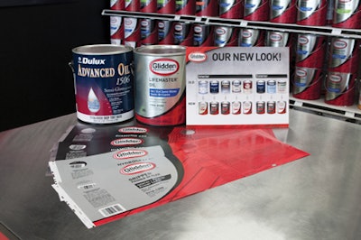
After acquiring the ICI Dulux brand of professional paints, AkzoNobel recognized the brand lacked organization and visual impact, and had not gained enough presence with large-volume paint contractors. AkzoNobel approached Interbrand to rebrand the U.S. line as Glidden Professional and also to establish a distinct and cohesive brand position and experience.
The new label design for Glidden Professional is masculine and trade-oriented, as well as sophisticated and consistent across the line. To improve shoppability, the logo stands out against a “shield” design whose color changes, depending on product variety. The shield is distinctive against a black border and the rich red color of the background on the bottom and right side of the can, which is accented with abstract patterns.