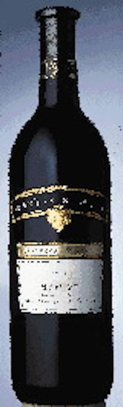
Few beverage marketers are as creative about their labels as today's wine bottlers. No wonder 10 of 53 award winners in this year's annual competition sponsored by the Tag and Label Manufacturers Institute were wine labels.
TAPP Technologies (Langley, British Columbia, Canada) converted all but one of these award winners.
TAPP won a first place award for Mission Hill's Private Reserve front and back labels. Marketers at the winery, located in West Bank, British Columbia, Canada, chose to update their labels because they wanted to make sure the package fit the persona of an internationally awarded winery, says Vinetta Peck, vice president of creative services at Mission Hill. Peck says the old label wasn't consistent with the other labels in Mission Hill's line.
"We changed it so that the consumers, when they walk into a retail outlet, will be able to see all our wines as one," she continues. "We love it. The overall perception was good, and it was very well-received."
The front pressure-sensitive label is printed offset on vellum, a smooth, uncoated paper face stock. TAPP used four colors, two hot-foil stampings, precision die-cutting and sculptured embossing. The back p-s label is printed offset on vellum in three colors, also with precision die-cutting.
Mission Hill wines are available in Canada at various prices. The labels were designed by M5 Design (Vancouver, British Columbia, Canada).
TAPP received a first place award for the front label on wine bottles from Baywood Cellars (formerly known as Las Vinas Symphony). It also won an honorable mention for the Las Vinas "neck and button" labels. The p-s labels for this Napa, CA-based winery are printed offset on silver metallized paper using four colors.
The wines retail for $12.99 and are being sold in California, New York, Massachusetts, Texas, Pennsylvania and Hawaii. The labels were designed by Gandr Design (Windsor, CA).
Baywood Cellars owner, John Cotta, says he is pleased with the label. "It's eye-appealing," Cotta says. "We think it's been well received. The old style, square label wasn't cutting it anymore."
An honorable mention award went to TAPP for a label used by Sawmill Creek winery of Niagara Falls, Ontario, Canada. Brand manager Barry Kovalski wanted to introduce a new line of wines called Sawmill Creek Cigar, and he needed a new label design. "Basically, this line is an extension of the Sawmill Creek Barrel Select," Kovalski says. "This wine is of a higher quality, has more varietal character and is still affordable. The initial reaction to the label has been favorable from what I've heard through our sales representatives and territory managers."
The p-s labels were printed offset on vellum using four colors. The label also employs a gold hot-stamping, an aqueous coating and die-cutting that makes it appear that an inset floats in the label.
Sawmill Creek wines are available in British Columbia and Ontario, Canada, and they retail for about $10 to $12 a bottle. The labels were designed by Blue Suede Studios (Vancouver, British Columbia, Canada).
Fetzer front and back
The back label for Fetzer Vineyards won a first place, while an honorable mention was awarded for the front labels for Fetzer Vineyards. The back p-s label from TAPP for the Hopland, CA-based vineyard is printed offset on vellum using three colors and gold stamping. The front label is printed offset on the same paper using process inks plus two colors with a third color printed over the gold foil stamp. The labels, designed by Antista/Fairclough (Atlanta, GA), display sculptured embossing and an aqueous coating.
John Law, vice president of creative marketing for Fetzer Vineyards, says the labels were designed for a new line. "We wanted to target the customer who is well-educated with wine, is still looking for an experience and is willing to spend $15 to $30 for a bottle," Law says. And he is more than pleased with the result. "The reaction has been fantastic," he continues. "The consumer's first impression is 'Wow, that's really beautiful.' We eat with our eyes. If you can get a customer's attention at that level, and then they say let's try that, you've provided an appropriate hook."
TAPP Technologies was awarded a first place prize for the Christophe Cellars label. The p-s labels for the St. Helena, CA-based vineyard is printed on an offset press using two colors. Also used is gold foil hot stamping. The label was designed by Caldaway Designs (Napa, CA).
The owner of Christophe Cellars, Jean-Charles Boisset, says she wanted to update the packaging for the wines, which retail between $10 and $12 and are available in North America and overseas. "Christophe is a brand that has been around for a long time," Boisset says. "It needed a little update. The old label had a solid look. Our tag line for the wine is now 'art of living.' We wanted a package to reflect that tag."
TAPP also won a first place award for the Bogle Vineyards label. The p-s label for the Clarksburg, CA-based vineyard is printed offset on vellum stock in five colors. Also used to produce the label were two foil stampings, aqueous coating and sculptured embossing.
Patty Bogle, the owner of Bogle Vineyards, said this label is a big departure from the old label. She decided to upgrade to a better glass bottle, and she wanted the label, designed by Auston Design (St. Helena, CA), to reflect this quality. "We really like the colors of the label," Bogle says. "We have gotten a very good response."
The one winning label that TAPP didn't convert was done by Italian converter Arca Etichette (Marcallo Con Casone, Milano, Italy). It won an honorable mention for the Il Pitosforo Portofino wine label. Ronchi Davide, marketing services manager at Arca Etichette, says the wine is a house wine of the restaurant Il Pitosforo Portofino in Portofino, Italy. The label is screen-printed in three colors and hot- stamped in one color.