The Meatsnacks Group, founded in 2015, is the leading producer and distributor of biltong (a form of dried, cured meat that originated in South Africa) and jerky in the U.K., and a major proponent of meat products as a healthy and sustaining snack. Having risen to market dominance through acquisitions, the group’s portfolio of brands had become fragmented and incohesive, and was in need of alignment and strategic direction.
Therefore, the group charged branding agency Pearlfisher to unite its portfolio around a powerful vision to bring it in line with contemporary need states, while remaining true to its entrepreneurial core. Pearlfisher kicked off the portfolio-wide visual overhaul with the rebrand of Cruga and Wild West, the group’s two most successful brands.
Following a comprehensive category audit informed by a deep-dive exploration into the future landscape of food, Pearlfisher’s Strategy team mapped the Meatsnacks Group’s portfolio on a spectrum of “authentic” to “adventurous.”
Says Kristoffer Fink Parup, Senior Brand Strategist at Pearlfisher, “By interpreting Meatsnacks’ brands as expressions of the company’s ethos—from the depth of experience and respect of process that define its approach, to the unbridled passion and pursuit of innovation that inspire its creations—our architectural organization gives the portfolio the flexibility to remain rooted in tradition while embracing exciting future propositions.”
At the center of the spectrum, defined by an equal measure of authenticity and adventurousness, is the group’s flagship product, Wild West. The U.K.’s original and leading jerky brand, Wild West embodies American masculinity and a spirit of discovery, but the identity and pack design, characterized by clichéd expressions of Americana, were failing to do this meaning justice.
Pearlfisher’s new essence for Wild West, inspired by the idea of “Expanding Horizons,” comes to life in a confident new design that evokes both rugged wilderness and urban exploration. Says Jon Vallance, Associate Creative Director for Brand and Graphics at Pearlfisher, “To take Wild West on a journey from ‘one-dimensional cowboy’ to ‘modern explorer,’ we centralized the design around an illustrated graphic of a mountainous landscape, which varies slightly for each of the eight variants.
“We re-appropriated the brand’s most distinctive equities, retaining the ‘swing’ of the logo but adding experience through texture and grit, and evolving the sheriff’s badge into a four-point compass star with a leftward-pointing arrow, which nods back to the old wild west. To reinforce a sense of exploration, we incorporated elements for the consumer to discover on pack: a ‘W’ in the negative space between the peaks, a person interacting with the landscape, and a cityscape on the back of pack to contrast urban and outdoor exploration.” Two exciting new Wild West variants—chicken and salmon jerky—were rolled out with the redesign.
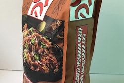
At the farthest and most “authentic” end of the spectrum is Cruga, the U.K.’s original biltong brand. Firmly rooted in a South African recipe and legacy, Cruga’s expression leaned heavily on stereotypical African motifs, which, though effective in communicating heritage, put the brand in danger of appearing contrived and therefore, inauthentic. Pearlfisher articulated a premium positioning for Cruga that brings a true appreciation of meat more boldly to the fore. A design essence of Slow Perfection captures the artisanal, expert process of making biltong while informing an honest and rustic direction for design.
According to Vallance, Pearlfisher once again retained crucial equities, such as the landscape and shield shape, but injected them with contemporary energy and a distinctly crafted appeal. “We developed an ownable logotype for Cruga that can be boldly activated in communication, and have used color and texture to move Cruga’s message and aesthetic from ‘African tribe’ to ‘African tactility.’ We’ve also used tribal patterns to signal flavor—triangles take on a more of a chili shape for that variant, for example—instead of evoking a one-dimensional and stereotypical feeling of ‘Africa,’ as they did before,” he says.
Says James Newitt, Managing Director at Meatsnacks Group, “Pearlfisher has done a brilliant job of upholding the pillars that define our brand—process, place, product and passion—while empowering us with flexibility, cohesion, and confidence to push the category boundaries and extend our portfolio into new realms of creative possibility.”
The Cruga and Wild West ranges launched in stores across the U.K. on Oct. 3, 2017.