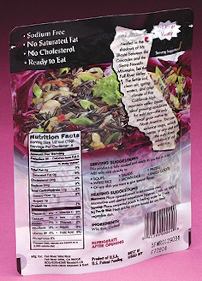
Certain package design elements are optional while others are required. Artwork on the pouch shows examples of both types.
One element—back-panel graphics including an illustration of the state of California—comes courtesy of another state: Minnesota.
“The reason we did it like that was that Minnesota has very strict labeling laws,” says Fall River general manager Hiram Oilar. “We had to plainly state that this was a product of California. It was felt that the clearest way to do that was by putting a drawing of the state right on the bag.”
Within the state’s outline is copy about the Fall River Valley area where the rice is grown. A red dot points out the area’s location on the map.
Another redesigned element is intended to cut through consumer confusion.
“The pillow packs were printed with copy that states ‘fully cooked ready to serve’”, says Oilar, “yet even in in-store demonstrations people weren’t getting it. They’d ask ‘How long do I cook it?’ so we knew the message was not getting through. We changed the new packaging so it reads ‘Ready in 2 min.’ on the front panel, which seemed to appeal better to people.”
See the story that goes with this sidebar: Pouches stand up to retorting